When designing #UI and #UX, consider the "Golden 8-bit Ratio".
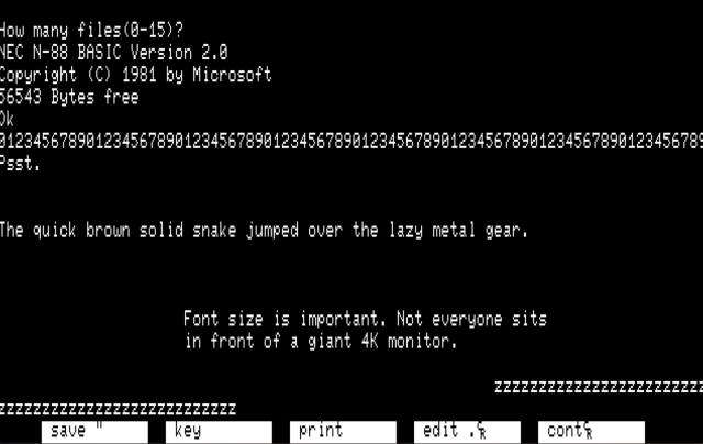
Text was never hard to read on 8-bit systems. A single character, generally 8x8, was a large enough portion of the screen to remain legible at distance (ie TV).
The textmode ratio of 40 or 80 chars wide by 25 chars high is a standard on MANY microcomputers and terminals. On terminals, this ratio exists today.
Consider making your text at least this large. Tiny text is really, really shitty.
