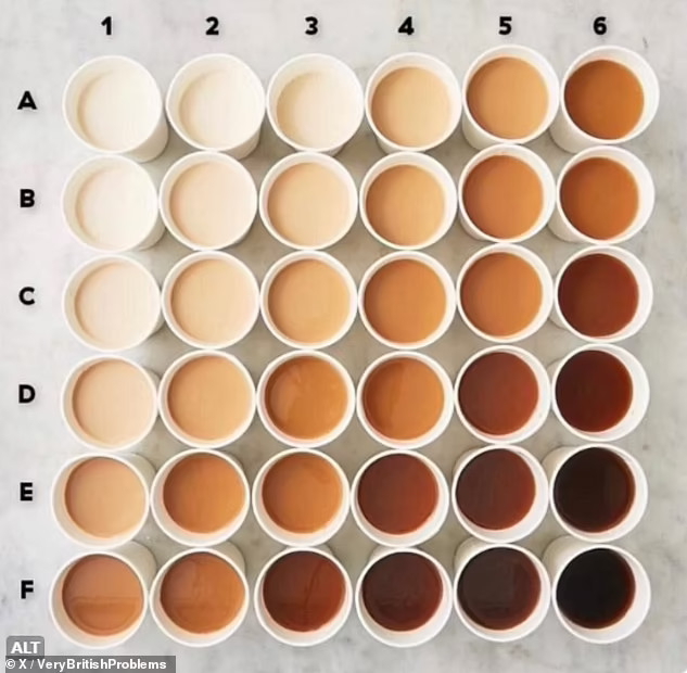
This "perfect #tea strength chart" pops up from time to time, and I struggle with the #maths of it.
At first glance it appears to show how tea strength changes in two variables. One variable is labelled 1-6, the other A-F, but (here's my first problem) it is not specified what is being varied along each axis. One *could* be brew time; the other *could* be milk quantity, but I don't know for sure, and even if I'm right there's no way to tell which is which.
Further, it appears to me that mugs along the same 45⁰ diagonal running from bottom left to top right have exactly the same colour. This may indicate that (if my guess at the variables is correct) any colour change introduced by altering brew time can be offset by changing milk quantity (and vice-versa), but this feels dubious.
I'm more inclined to believe that there is actually only one variable at work here (if pushed, I would guess that it's the amount of milk), and that instead of 36 different strengths of tea there are actually only 11.
I think this 2D chart should really be a 1D spectrum, and that the conductors of the study have chosen an unnecessarily complicated visualisation which implies things that aren't true. It's almost as if this isn't the result of dedicated and rigorous academic practice.
