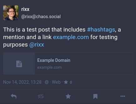
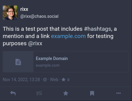
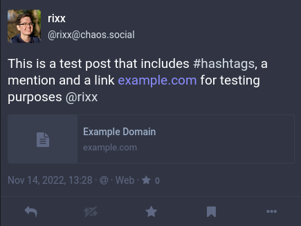
Here's a #mastoadmin tip: Use your powers of custom CSS to make Mastodon more accessible. The default link highlight colour (both 3.x blue and 4.x purple) contrasts are not WCAG compliant.
Illustrated below – we also highlight mentions and hashtags like links to make them easier to see – I find the default of "usernames are not quite white, but it's hard to see the difference" pretty distracting.


