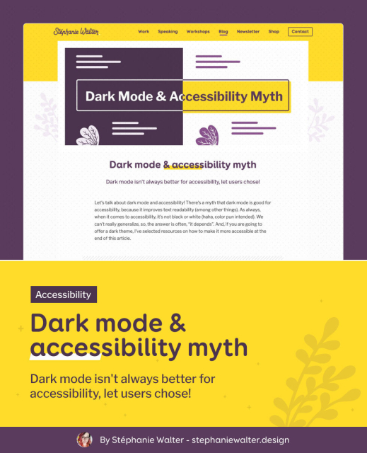
Let’s talk about dark mode and accessibility! There’s a myth that dark mode is good for accessibility, because it improves text readability. It's not always true.
The full article and resources on my blog: stephaniewalter.design/blog/da…
#Accessibility #DarkMode #Astigmatism
Dark mode & accessibility myth by Stéphanie Walter - UX Researcher & Designer.
Dark mode isn't always better for accessibility, you need to let users chose. And if you build a dark theme, make it accessible!Stéphanie Walter (Stéphanie Walter - Senior UX Designer, Mobile Expert, Conference Speaker, Blog writer and Teacher.)

Seirdy
in reply to Stef Walter • • •APCA Readability Criterion • Contrast
Inclusive Reading Technologies