Search
Items tagged with: Accessibility
Inclusive Design 24 (#id24)
A free 24-hour online community event on accessibility and inclusionInclusive Design 24 (#id24)
I'm happy to announce that I will be presenting about the #WebAlmanac for the December Boye & Co Member Call:
boye-co.com/groups/conference-…
Using the Web Almanac to Understand Trends with Mike Gifford
I will be talking about #CMS, #JavaScriptframeworks and of course #sustainability and #accessibility
10 December - Free with Registration
Today's Web Design Update: groups.google.com/a/d.umn.edu/… Subscribe info: d.umn.edu/itss/training/online… #Accessibility #A11y #WebDesign
Featuring @todd@a11y.info, @theaccessibilityguy, @TPGi, @ozewai, @ScopicEngineer, @codepo8, @medienbaecker, @shadeed9, @LFLegal, @heydon, @tbroyer, @jarango, @AlexDawsonUK, @InesAkrap, @mgifford, and more.
Web Design References: Webdev Newsletter
Web Design References: News and info about web design and development. The site advocates accessibility, usability, web standards and many related topics.www.d.umn.edu
I have emphasized numerous times in the past why you should not use #HCaptcha, especially in situations where equal access is vital. Their practices are not inclusive, locking out users who have no other way to access whatever the captcha protects. This blog post illustrates one of the scenarios: michaels.world/2023/11/i-was-b…
Here's to better captcha solutions in the future, or to indeed existing ones, such as mcaptcha.org/ #a11y #accessibility #blind #captcha
I was banned from the hCaptcha accessibility account for not being blind | The Blog of Michael Taboada
Also known as: why you shouldn't trust a company who makes their product intensionally inaccessible with allowing you an accessibility workaround Update: I've been informed that hCaptcha now has a text captcha option.Michael Taboada (The Blog of Michael Taboada)
I'm happy so many people liked my first article!
Now I wrote about why focus outlines deserve better treatment in web design, and how to make them both beautiful and accessible ✍️
medienbaecker.com/articles/foc…
#accessibility #webdev #webdesign #indieweb
Beautiful focus outlines
Baker’s son turned web developer, kneading pixels and code for 15+ years. I help you bake your ideas into websites 🥨.Thomas Günther (medienbaecker.com)
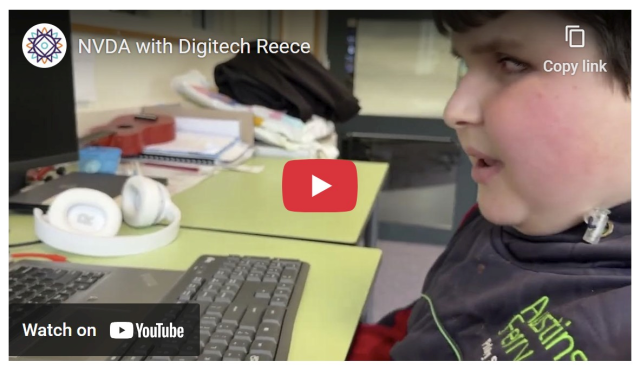
Are you in Melbourne today? Come down to Statewide Vision Resource Centre in Donvale and see Sascha and Quentin, learn about what's new with NVDA, and check out everything else at SVRC's Tech Expo!
#NVDA #technology #accessibility
From 2023, but i only read it today: michaels.world/2023/11/i-was-b…
I was banned from the hCaptcha accessibility account for not being blind | The Blog of Michael Taboada
Also known as: why you shouldn't trust a company who makes their product intensionally inaccessible with allowing you an accessibility workaround Update: I've been informed that hCaptcha now has a text captcha option.Michael Taboada (The Blog of Michael Taboada)
@TPGi is looking for a Full-Time, Remote in US Accessibility Engineer. The core responsibility will be to Perform accessibility evaluations of web pages, desktop applications, mobile apps, and other emerging platforms. Interested? Please send your resume to Careers@TPGi.com.
#Jobs #A11yJobs #AccessibilityJobs #DigitalAccessibility #Accessibility #A11y
Accessibility Engineer - TPGi
Accessibility Engineer Full-Time // Remote in US Primary Function The Accessibility Engineer will advise our clients on how to make their digital offerings conform with the standards of accessibility and...TPGi
tetralogical.com/blog/2024/09/…
XR Accessibility: for people with seeing disabilities - TetraLogical
Extended Reality (XR) experiences tend to focus on providing rich, visual content to convey information. But we need to consider how we convey the information in these experiences to people who can’t see them.TetraLogical
It’s technicaly accessible, but presents a few problems. focus is never on a post, but on an element within a post. So you may find the Like button rather than the post itself, and you need to swipe through every element of each post. That’s a real pain. Also, some buttons either don’t work at all or do something unexpected.
I found navigation very difficult and was never quite sure where I was.
I haven’t found any images with Alt Text either.
The layout isn’t great.
All in all, it’s a bit of a trial to use. It’s almost as if they haven’t really bothered with #Accessibility. Fancy that!
Perhaps I should persevere with it, but, quite frankly, life’s too short, so I won’t be using it.
Dear Mastodon,
If you could stop suggesting that I change my carefully chosen camel case hashtags to all lowers, that would sure be swell.
😠
Finished @viscousplatypus’s “The Accessibility Operations Guidebook” this morning. Probably a good idea to read if you do digital accessibility and want to scale up your impact. I recommend.
This quote from a former independent consultant who has become an employee really lands.
Info on The Storygraph:
app.thestorygraph.com/books/82…
Buy (I did the Payhib ebook but read it on my Kobo; no Amazon in this house):
devonpersing.netlify.app/book/
The Accessibility Operations Guidebook: To making accessibility work more sustainable by Devon Persing
The accessibility field has a burnout problem. People get into this work to make accessible produ...app.thestorygraph.com
We’d like to hear if those using the current Facebook for iOS build are still experiencing the bug where it is not possible to review content you write when composing a Facebook post.
#Accessibility & #Disability picks of the day:
➡️ @BlindHistoryLady - Blind historian on blind individuals from history
➡️ @NVAccess - Non-profit developing free open source screen reader
➡️ @WeirdWriter - Writer, blogger, advocate for accessibility
➡️ @podcast - Podcast on blind accessibility in tech & games
➡️ @dgsv_handball - Handball teams of German Deaf Sports Association (in German)
➡️ @socialaudiodescription.com - Collective producing audio description
🧵 1/4
After exploring #R2E, I've decided it might not be the best fit for my needs. Here's why:
1. R2E doesn't support #Inoreader's #OPML format, requiring manual feed addition.
2. I realized I have many feeds and need a more comprehensive solution.
I'm now considering #Miniflux, which can manage #RSS feeds, #Podcasts, and #YouTube subscriptions in one place.
Until I get my #RaspberryPi for Christmas, I'm weighing two options:
1. Self-host Miniflux on my #Windows PC using #Docker
2. Use their $15/year hosted plan temporarily
Fellow #techies, especially those interested in #accessibility and #SelfHosting: What would you recommend? Your insights would be greatly appreciated!
#Tech #blind
@mastoblind @main
Yikes, the FOMO is certainly not worth the accessibility nightmare this Bluesky website is.
It's a perfect example of usable, but not accessible.
It's a bunch of labeled elements with no structure whatsoever so you're tabbing through endless links, buttons, and links, and buttons, and links, and buttons, to get somewhere. Forget reading a thread with replies, that will take you forever because there is no structure, at all, to aid in navigation. No landmarks, no heading structure, no headings at all, just links and buttons, links and buttons, and the search is on some different page so I can't even get back to the top quickly. Blind people can have Bluesky because I don't have FOMO.
Some of the most common #accessibility issues I see in the shortlist of 300-400 sites (filtered from 10 million):
- Links only distinguishable through a hue change. I consider links discernible through page structure (e.g. simple navbar links) exempt, but for in-text links we need to see the beginnings and ends of their interactive regions. Underlines work; outlines are another approach I’ve seen.
- No landmarks, or stuff outside landmarks. Everything should be in a landmark:
header
,main
,section
,footer
, and/oraside
are what you typically want on the top-level, directly underbody
.main
is the most important. - Misuse of or missing headings. Your page needs one (yes, one)
h1
that titles the page, not your entire website. Don’t skip heading levels just to get smaller text. Don’t use headings for stylized text. A lower heading following a higher heading looks like a subtopic of the higher heading, not its own thing. - Contrast. I recommend the APCA contrast tool. Don’t lose sleep over the occasional superscript having barely sub-optimal contrast; focus on bigger issues if you’re 99% perceptible. Often, background images are the culprit; remember that users override foreground and background colors and may use a different viewport that results in text in front of a lighter/darker part of the background image. Contrast issues with images are nearly impossible to automatically detect with popular tools.
- Focus indicators that are invisible or barely-visible, or rely solely on hue changes.
- Fancy bespoke hidden/toggle-able menus whose hidden items are still accessible via keyboard navigation, making me tab through items I can’t see.
- Interactive items using font icons whose accessible names are unicode code-points, even if the author clearly tried to give them readable names.
- Really unhelpful alt text like “diagram of X” without actually explaining the things being diagrammed, whether in alt-text or a caption.
- Animations that don’t respect
prefers-reduced-motion
.
Link imperceptibility, missing landmarks, and heading misuse are really common.
A common nit-pick: lists of links (e.g. in nav
) would benefit from ul
or ol
parents.
A common issue that isn’t exactly an accessibility issue: toggles like hamburger menus that require JS don’t work in the Tor Browser’s “safest” mode. I’m looking at simple websites that have no need to exclude anonymous visitors.
Good morning everyone! As you all know if you follow me, I'm a sighted dev whose focus is on accessibility for the blind. I got into the space of accessibility and learned how important it was because I joined an accessibility jam and got first hand experience speaking with blind gamers. So I'm inviting you to the type of jam that changed my outlook! So join the discord for "Games for blind gamers" and ask your questions!
discord.gg/tqQXqX8gEq
Join the Games for Blind Gamers Discord Server!
Check out the Games for Blind Gamers community on Discord - hang out with 183 other members and enjoy free voice and text chat.Discord
@1password @mastoblind @main
Today's Web Design Update: groups.google.com/a/d.umn.edu/… Subscribe info: d.umn.edu/itss/training/online… #Accessibility #A11y #WebDesign
Featuring @aardrian, @piccalilli, @yatil, @mgifford, @karlgroves, @seaotta, @jakelazaroff, @theadamsilver, @AlexDawsonUK, @gerrymcgovern, and more.
Web Design References: Webdev Newsletter
Web Design References: News and info about web design and development. The site advocates accessibility, usability, web standards and many related topics.www.d.umn.edu
Blind and Low Vision Gift Guide - Fall 2024 - TIM DIXON
Need some inspiration on what to buy for someone who is blind or low vision? look no further than this hand gift guide for winter 2024.Tim Dixon (TIM DIXON)
In episode 1, @President Riccobono will officially launch the podcast, and you’ll hear an introduction from its host, Jonathan Mosen.
Our regular News Bits feature looks at some tech news through a blindness lens.
Jeremy Curry from Microsoft joins Jonathan to talk about a new AI product, called Ask Ma, which provides #accessibility specific information on using Microsoft products and services.
Hey folks! I'm getting back into Thunderbird as my main email app on Windows and I'm on the hunt for some great add-ons.
I'm especially interested in **accessibility-focused add-ons** that play nice with NVDA and JAWS screen readers. But I'm also curious about any **cool add-ons** that make Thunderbird even better, even if they're not specifically for accessibility.
Got any recommendations? Share them here!
Tagging @mastoblind and @main to spread the word. This is for my fellow blind users, but anyone with a favorite Thunderbird add-on, please chime in!
#Thunderbird #Accessibility #ScreenReaders #EmailAddOns #blind
Anyone have suggestions on where to try to promote the Games for Blind gamers gam jam? We got 110 sign ups last year, and hoping to get more sign ups this year!
itch.io/jam/games-for-blind-ga…
#GameJam #gamedev #indiedev #accessibility
Games for Blind Gamers 4
A game jam from 2025-02-01 to 2025-03-10 hosted by NightBlade. Welcome, Blind and Sighted Game Developers! Welcome to the fourth annual Games for Blind Gamers jam! The goal of this jam is to build awareness of bli...itch.io
This is the line I see over and over again:
“While technology offers promising alternatives, it's essential to recognize the unique benefits that guide dogs provide beyond navigation, such as companionship and emotional support.”
If this is true, if these benefits are so unique, why do only 2% of blind and visually impaired people in the UK currently use a guide dog?
#Accessibility #AI #Blind #Disability #GDBA #Glide #Glidance #RNIB
AppleInsider (@appleinsider@mastodon.social)
Amazon drops early Black Friday deals on Apple's new M4 MacBook Pro, Mac mini, iMac -- and even the M2 MacBook Air 16GB https://appleinsider.Mastodon
#Accessibility #Blind #Disability #AssistiveTech #Inclusion
If you've been looking for that next semi-cheap music-making fix but haven't decided what to get, consider Ableton Move.
If you look at the official videos, literature and documentation, you'd be fooled into thinking that it's not actually accessible. This is incorrect.
It runs a web-server for helping you manage samples,recordings and sets, but it also has an undocumented screen-reader which I demonstrate in this video.
Next to Komplete Kontrol, I can say that this has been the most innovative, fun and game-changing piece of hardware I've owned and I thoroughly enjoy working with it.
#InspiredBySound - Let's Move! (Ableton Move Accessibility Overview) youtu.be/p8IbinbOhY4
Excerpt from Peter Kirn's blog about Move:
‘How do I access Move with a screen reader?
Andre Louis has a walkthrough for you, as pointed out here in comments! And as always, it’s terrific. This is honestly worth a watch for sighted users, too, to understand how these interactions work – and it’s required viewing if you work in instrument design.’
cdm.link/ableton-move-guide/
#Ableton #AbletonMove #Accessibility
#ScreenReader #A11y #Blind
Ableton Move guide: tips, tricks, questions answered, hacks - CDM Create Digital Music
Move, the all-new compact all-in-one hardware platform from Ableton, got your attention - whether you loved it, hated it, or just weren't sure.Peter Kirn (CDM Create Digital Music)
Now I’m grieving. Soon(ish) it’s back to the work of #accessibility and inclusion.
Here’s what I wrote the day after the U.S. election: lflegal.com/2024/11/harris-def….
Today We Grieve
So many swirling emotions today. November 6, 2024. The day after the United States elected its first felon, a man who is transparent and loud in his cruelty, racism, and disdain for women and their bodies.Law Office of Lainey Feingold
For the love of all that is holy, can you all please start using `<a>` for navigation and `<button>` for actions, not the other way around?
Please don't make me turn this into a blog post.
Signed, someone who couldn't right-click to "open in a new tab" when it mattered.
A few months ago I wrote about how I approach alternative text for images and tried to offer context for each of my considerations.
“My Approach to Alt Text”
adrianroselli.com/2024/05/my-a…
I also link other resources that are not mine.
My Approach to Alt Text
I ran across a survey from Tilburg University on the experiences and perspectives of image describers. It asked what process I follow to write image alternative text, and it occurred to me that I don’t use a checklist or guideline anymore.Adrian Roselli
New blog post! 📝
"My anti-overlay client letter" — I'm often asked about accessibility overlays, and this is the email I send to clients when that discussion gets serious.
It may be helpful to others making the case against overlays and laying down the facts.
alistairshepherd.uk/writing/ac…
My anti-overlay client letter - Alistair Shepherd
I really dislike accessibility overlays and am often asked about my thoughts or to implement one. This is my email response when that discussion gets serious.Alistair Shepherd
Want to learn about how to use and run accessibility testing with NVDA?
Our friends at @intopia have an upcoming Public Training Course which kicks off on Tuesday 12th November.
The course involves 3 x 2 hour sessions over 3 weeks.
The course is very hands-on with activities throughout each session. Learn how to quickly setup & use NVDA for #A11y Testing, navigation, exploring graphics, elements, forms & more!
Full info & registration: lnkd.in/g9rZCJvN
I'm curious to hear from fellow blind users about your favorite accessible Windows apps! I just reinstalled Windows and would love some recommendations. What apps do you find essential for daily tasks, productivity, or just for fun? Please share your favorites! #Blind #VisuallyImpaired #Accessibility #WindowsApps #AssistiveTechnology #Windows