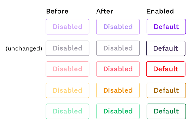
Great article on disabled buttons and #accessibility: uxdesign.cc/what-should-be-the…

What should be the contrast level of inactive buttons?
Disabled buttons. They need to look non-interactable. But they also can’t be completely unreadable. How do I find the sweet spot? I spent a few hours in a deep dive going through a bunch of blogs and…Giulia Alfarano (UX Collective)