We've introduced a new logo with a very strong message:
Turn on Privacy 🔒
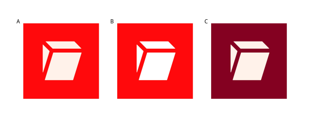
We love how this logo represents our mission to bring #privacy to the world, but we'd also like to hear your feedback.
Which of the following is your favorite? A, B, or C ⁉️ - Poll in reply!
Read more here: tuta.com/blog/new-logo-announc…
"Turn ON Privacy": Tuta has a brand new logo!
A new name deserves a new logo - check out the Tuta light switch that keeps your data private by default.Tutanota
Tuta
in reply to Tuta • • •- A (17%, 73 votes)
- B (16%, 72 votes)
- C (66%, 284 votes)
429 voters. Poll end: 4 months agoSobral
in reply to Tuta • • •T1M_Or
in reply to Tuta • • •Pixelcode 🇺🇦
in reply to Tuta • • •Pufflui
in reply to Tuta • • •darkm
in reply to Tuta • • •TimePencil
in reply to Tuta • • •VIPIN / വിപിൻ
in reply to Tuta • • •Fish/Meercat 😷
in reply to Tuta • • •ankenre
in reply to Tuta • • •whoami
in reply to Tuta • • •Foxle
in reply to Tuta • • •Earl Hickey
in reply to Tuta • • •vrgovinda
in reply to Tuta • • •Chłop Marcin
in reply to Tuta • • •incognitoMD
in reply to Tuta • • •knilz
in reply to Tuta • • •Tuta
in reply to knilz • • •Neutronleak
in reply to Tuta • • •I wish the logos didn't look like a garbage chute. They would be more appropriate if Tuta specialized in handling spam, though.
ecomatrix.in/images/products/g…
TimePencil
in reply to Tuta • • •The new logo is meant to denote that "privacy has been switched on" and in some countries, that switch position IS "On".
However, in the USA (which is, arguably, a country in dire need of privacy protections for its population) that Tuta "switch" is shown as "Off".
Any company logo MUST have clear, universal, and unambiguous meaning, especially where the market is international.
I love your work, Team Tuta, but your new logo is a failure. (Although, your service is pretty good!)
Frantisek Nagy
in reply to Tuta • • •This new logo is simply meaningless. It's not modern, it's not beautiful, it's not aesthetically pleasing, it doesn't convey any message. If I hadn't looked it up, I would have never realized that this is supposed to be a switch. I understand the need for a brand refresh, but you have to admit it was a misstep. I don't even understand how this could have been accepted by Tuta's team as a new logo.
Json Doh
in reply to Tuta • • •Tuta
in reply to Json Doh • • •Dietmar Janowski
in reply to Tuta • • •DPD-
in reply to Tuta • • •abhishek
in reply to Tuta • • •Marcos D. Alves
in reply to Tuta • • •Marcos D. Alves
in reply to Tuta • • •Tuta
Unknown parent • • •Tuta
Unknown parent • • •Wuckeline 🌻 🎶 💻
Unknown parent • • •Thanks for your answer and for your great work! 👍❤🍀
not_djinn
in reply to Tuta • • •Tuta
Unknown parent • • •