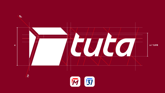
Hey Tuta Fans! Want to know how Tuta's new visual universe is improving our growing range of products? 🎨
Read Tuta's rebranding story told by our talented in-house designer Daniel 👉tuta.com/blog/tuta-new-creativ…
#TurnonPrivacy #Rebrand #Tuta
#MadeinGermany #Design
Rebrand Tuta: Opening the source of our new visual universe | Tuta
Turn ON privacy. That's what we offer since day 1 of Tuta(nota). Now our brand architecture reflects this in a new app ecosystem.Tuta

Foxle
in reply to Tuta • • •And the way you changed the look, does not suit my taste...
I don't see improvements...
Ori
in reply to Foxle • • •@Foxle
Indeed.
But anyway, give us back icons with a "non-white" background on Android, so we can visually find the applications faster.
Tuta
in reply to Ori • • •Alex
in reply to Tuta • • •EKO
EKOTuta
in reply to Alex • • •