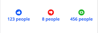
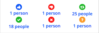
I'm considering changing the engagement details below posts and comments now that Bookface shows icons for them. The current appearance is a vertical list, which can leave a lot of unused space to the right of it, plus all the explanatory text feels redundant and visually cluttering to me:
So I'm considering eliminating the explanatory text and going with a horizontal list of just names (for single interactions) and counts (that trigger the pop-over list) like this:
But that got me to an option with just icons and counts, which is similar to how Facebook and Misskey/Sharkey show reactions/engagements:
Which is what I'd prefer as it looks the cleanest and most consistent.
Thoughts on this proposed change? (I really wish Friendica had polls for this sort of thing!)


Pygoscelis Papua
in reply to Pygoscelis Papua • • •Spent some time revisiting this. Not sure now whether to implement it at all frankly.
After initially trying to arrange it as suggested by @marcus suggested I gave up trying to do it with flex or grid and ultimately I still wound up never knowing if an element would end up on the right or left to adjust the pop-over positioning. Part of this is because the containers exist whether they have anything in them or not and even :empty pseudo-class wasn't helping. I ended up just using old-school floats, because then I could at least be assured the Event responses would always be to the right to adjust the pop-over positioning. The downside is that the attendence counts are in the reverse order of the buttons because of float: right;:
It was also problematic to put the "Reactions and Reshares" and "Attendance" labels because all the engagement counts are in a single .wall-item-responses container, and that isn't the only place that class name is used.
But I don't think this floated horizontal list will work on mobile really at all. It looks pretty messy if you keep the one set of responses floated left and the other still float right:
Which still does not fix the issue with the pop-over not having enough room and potentially breaking the mobile layout if the expanding element is positioned too far to the right, with no way of knowing if that particular button is ever toward the left or right:
Because you never know how many of these responses will be populated. That "Reshares" button might be the only one, in which case it's to the left, or there may be "Likes" and "Dislikes" (as shown here) that push it too far to the right to properly display its pop-over.
I can't use :nth-of-type() or anything to target containers too far to the right because they collapse and even if I use the :empty pseudo-class to display: none; the ones with nothing in them they still exist regarding the count. I'd have to add checks for empty siblings for every possible combination of any, some, or all of the containers being populated or unpopulated. Oh, and there's a hidden, unused ".wall-item-comment" container in there too to deal with.
But, simply shifting this list back to a vertical one on mobile looks even worse than how it currently looks because it creates even MORE blank space to the right of the list:
So if I have to leave things as they are for the mobile layout is there any real advantage to changing to the horizontal layout for the desktop layout?
Another factor is that there is no way of ever knowing how many characters the actual count will be on any one of these response items. I looked at the Friendica code and there does not appear to be any limitation. The ONLY limitation appears to be on the pop-over list, where it is limited to showing 75 entries total (actually 74 + "and xxxx more" text).
Granted, I've never seen more than thousands of reshares on any post and that was something from a celebrity account on Mastodon, but there also doesn't appear to be anything in Friendica's code to truncate the number if it is large. For example on Facebook if it's 1,280 Likes it will truncate it to "1.2K" or if it's 26,568 Shares it will be truncate it to "26K" - there doesn't appear to be anything in Friendica's code to do that. Probably because that level of engagement is generally unlikely in the Fediverse, but still there is no way to know if the engagement count on any given response item will be one character or six or more.
This change may not be worth doing?
@xy.. @Michael 🇺🇦 @Jesper Ross Stocholm @Friendica Support
Marcus
in reply to Pygoscelis Papua • • •Would it help with writing the handling logic if "reactions and reshares" and "attendance" were instead on two rows, which would still bring it down from six to just two rows, and only one row for content that isn't events? At least then there's no left/right logic necessary I hope?
I need a proper development environment setup to experiment more with UI changes myself. Preferably a Docker/Podman setup that isn't vscode/microsoft-specific (devcontainer). While vagrant does support docker the friendica vagrant setup is currently only written for libvirt and virtualbox.
Pygoscelis Papua
in reply to Marcus • • •The left/right logic isn't a problem on desktop, it's more of a problem on mobile because the screen is so narrow if three items are shown in a row and the last one has a pop-over the position of the pop-over needs to be right: 0px; or it will partly be off-screen, which breaks the mobile layout.
I haven't given up, but it's going to need a lot more CSS logic than just a float or flex layout offer. Probably some "nth" sibling element checking for :empty or something.
I'd really like to get it working for mobile since the entire reason I started messing with this was to compact that information for the mobile layout.
Marcus
in reply to Pygoscelis Papua • • •I've mostly been thinking about and using the desktop layout and I think any of your suggestions would be a good improvement there as well!
I'm familiar with CSS too but I have a hard time fully visualizing the problem to come up with good suggestions. Once I have a dev setup I can hopefully help a bit more with things like this.
Pygoscelis Papua
in reply to Marcus • • •Ok I think I've got it! The trick was to use GRID layout not floats or flex. By using grid I can always be assured of the left/center/right placement of a response container so I can adjust the position of the pop-over if it has one.
So here's what a normal post/comment would look like on desktop:

and here is what an Event post would look like:

And a regular post/comment on a phone in portrait:

And an Event post on a phone in portrait:

And added bonus of the icon-above, centered layout for phones is it separates the touch target areas from each other making it easier to tap only the one you intend to.
I also checked to see what would happen with absurdly large engagement numbers, since Friendica doesn't appear to filter/truncate the numbers. Not that anyone will ever get this kind of engagement but I wanted to see if too many characters would break the layout:

There are some slight issues with older browsers that don't understand the :has() pseudo-class, but they are minor. On desktop the full boat of responses on an Event post aligns the "shares" and "maybe" to the right, so the icons might not line up, and the grid reserves space below for Event buttons even on regular posts and comments because I'm using :has() to get the count of items in the .wall-item-responses container to adjust the adjust the space reserved for grid-template-rows. But we'll soon be moving past the point where anyone should be using browsers that don't understand that pseudo-class or grid level 1 layout. I'm not going to worry too much about accommodating outdated browsers. Though I should probably look at this with my ancient iPad Mini and see how screwed up it is.