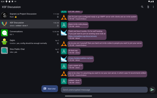
I don’t use the tablet UI in #Conversations_im. To be honest I hardly think about the fact that Conversations even has one.
However if you are using Conversations on a tablet and have suggestions for low hanging fruit / quality of life improvements I’m happy to implement them.
Recently someone suggested using the chat title as the activity title. (Apparently the highlighted chat is not enough of an indication of what chat you are currently in.)

#XMPP #android

This entry was edited (7 months ago)
in reply to Daniel Gultsch

The tablet layout is handy on Chromebooks, where I use it. I do not have big problems with the UI, even if it's apparent that it is not a first-class citizen.
in reply to Daniel Gultsch

I use this UI because I am running Conversations on a Chromebook. It is not my place to ask for anything from this great project, but if any consideration will be made in the future for improving Chromebook compatibility I would be highly appreciative. It could be something like enabling navigation for physical keyboards, or addressing some odd errors that seem to affect ChromeOS only. I've been using the app this way for over a year, and while all essential functions appear to work flawlessly, certain menu items fail. (I think user-specific options in MUC don't work.) I realize Conversations is not designed to work as a desktop app, but it is vastly superior to anything else that will run on a Chromebook.
in reply to Daniel Gultsch

I use Conversations primarily on tablet, but never tried the tablet UI 😁

Time to give it a try.

in reply to Daniel Gultsch

I'm also using on ChromeOs. If the contact/room UI bar on left side get option of drag left and right according to user will. This will be awesome feature. As for now it cover alot of space and it irritate. Better if it only support contact/room image and rest space for mesages within that. Like element.