Hello @Friendica Developers @Friendica Support @friendica-dev.mbbit.de/profile… Hello dear community, I would like to discuss with you about the appearance of posts with multiple images on #Friedica. Here is my opinion:
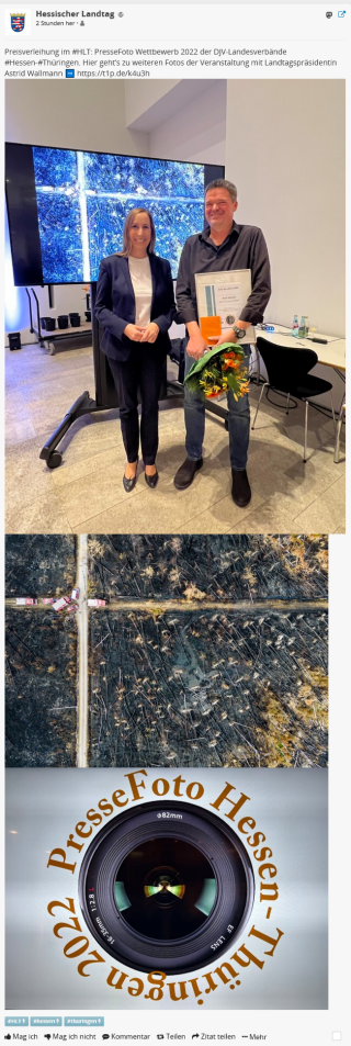
The current way multiple #images are displayed is awful:

Yeah, you saw it by my embedded examples your self. What bothers me most is:
- It just looks messy (especially when there is a mix of landscape and portrait format)
- Besides the aesthetics, multiple images take a lot of room (when you do not use an add-on like show more)
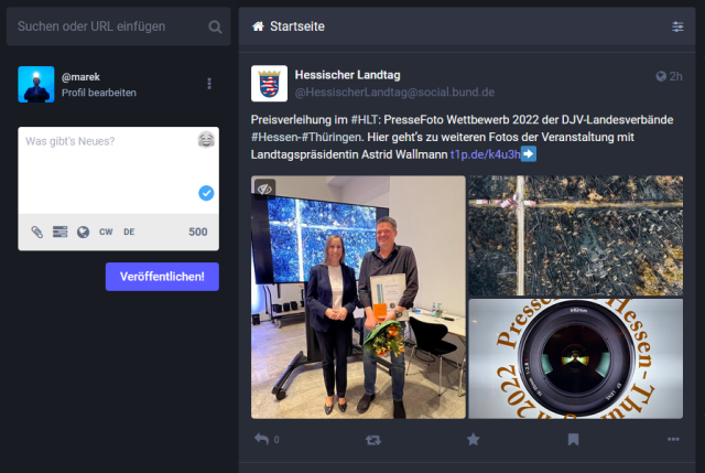
My suggestion on which I would love to hear your opinion is to use a grid format like on #mastodon:

I would pitch a suggestion by adding a PR for a (from my point of view) "better" appearance based to this
tutorial. I do not like to use JS in general and would leave it out by determine the suited amount of columns in the backend.
But before I invest time on that, I want to hear your feedback. Thank You!


