heather-buchel.com/blog/2024/0…
by heather buchel #a11y #UIDesign
A letter to my younger self, as an accessibility advocate
All of the things I get to say "I told you so" about, now.heather-buchel.com

All of the things I get to say "I told you so" about, now.heather-buchel.com
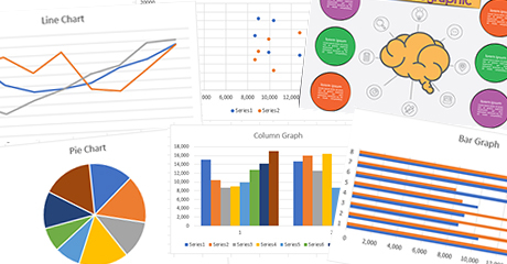
Data visualizations aim to make information easier to understand through visual presentation, but they can have specific accessibility implications for people with disabilities.Ricky Onsman (TPGi)
A terrific 3-part series on colored blindness, accessibility, and data visualizations.
Part 1: blog.datawrapper.de/colorblind…
Part 2:
blog.datawrapper.de/colorblind…
Part 3:
blog.datawrapper.de/colorblind…
#a11y #webdesign #UIDesign #color #dataviz #colorblindness

'One notices being colourblind more often when looking at data visualizations': Ten experiences.Lisa Charlotte Muth (Datawrapper Blog)
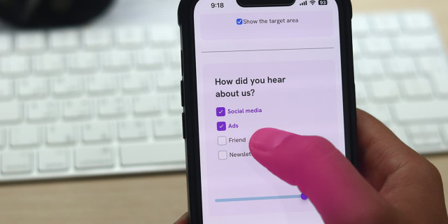
An interactive guide on designing better target sizes on the web.ishadeed.com

Data-entry form fields on websites are crucial for ecommerce and many other applications. Fields need labels and (sometimes) instructions, but placing this t...YouTube
Explore IBM Design’s approach to designing for sustainability -- link to PDF white paper including design checklist for sustainability 🌎
ibm.com/design/practices/desig…
#IBM #design #UIDesign #sustainability #environment #goGreen
At IBM, our design philosophy is to help guide people so they can do their best work.www.ibm.com
History of checkboxes and radio buttons in user interfacestonsky.me

Learning about UX? Or working with UX professionals? Find out what they're talking about in this community-built UX dictionary.UX dictionary

An interactive guide on designing better target sizes on the web.ishadeed.com
16 Lesser Known Accessibility Issues [and Tips]
toward.studio/latest/16-lesser…
"12. Don’t hide labels. Ever."
#a11y #accessibility #webdev #webdesign #tips #UIDesign #forms
In this post Matt discusses 16 accessibility issues and solutions we've encountered while building a bi-lingual website application for a public sector…Toward Studio

Learn how to create accessible text in your web content.Whitney Lewis (Pope Tech Blog)
A comprehensive list of accessibility tools and resources for designers to achieve accessibility from start.Raghavendra Satish Peri (DigitalA11Y)
Animation and accessibility are often seen as two separate powers at odds with one another. How is it possible to strike a balance between elements that move and the possible negative effects they expose to users who are sensitive to motion? Oriana G…Smashing Magazine
Related: 4 examples of web-accessible date pickers...
WAI: w3.org/WAI/ARIA/apg/patterns/d…
Deque: dequeuniversity.com/library/ar…
U.S. Web Design System
designsystem.digital.gov/compo…
Tommy Feldt: fymmot.github.io/inclusive-dat…
#date #calendar #UIDesign #webdesign #webdev #a11y
Accessibility resources free online from the international standards organization: W3C Web Accessibility Initiative (WAI).W3C Web Accessibility Initiative (WAI) (Web Accessibility Initiative (WAI))
About CSS prefers-reduced-transparency:
developer.chrome.com/blog/css-…
#UIDesign #CSS #usability #a11y

Optimize and adjust for users who prefer an opaque UI.Chrome for Developers
The problem with disabled buttons and what to do instead:
adamsilver.io/blog/the-problem…
Disabled buttons suck:
axesslab.com/disabled-buttons-…
#UIDesign #forms #usability #a11y #accessibility

Showing buttons as disabled until a form is complete might seem like a good idea. It is not. They usually create a lousy user experience and exclude many people with disabilities. Here's why disabled buttons suck and what to do instead.Hampus Sethfors (Axess Lab)
A Cognitive perspective on UX Design Principles including a neurodivergent perspective with links to relevant guidance and resources.www.ab11y.com
4 design principles I use every day to avoid bad UX and create products that work for everyone (by Adam Silver)
adamsilver.io/blog/4-design-pr…
Principle 1: Good design works for everyone
Principle 2: Good design makes things obvious
Principle 3: Good design puts users in control
Principle 4: Good design is lightweight
#UXDesign #UIDesign #webdesign

Adam Silver – interaction designer - London, UKAdamsilver.io
The 7 Principles on the Centre for Excellence in Universal Design website.universaldesign.ie
Adam Silver – interaction designer - London, UKAdamsilver.io
Adam Silver – interaction designer - London, UKAdamsilver.io
Low numeracy affects half of adults in the UK. Many live with the limitations of not understanding numbers and the impact that has on everyday life.Accessible Numbers
Float labels may put you in the cool club, but they’re terrible UX.
It’s much better if your input’s label:
1) is legible
2) is above the input
3) doesn’t move about
4) is not mistaken for an answer
Simple > clever
-Adam Silver via Twitter

Tooltips are not only hard to use, but they're normally totally unnecessary. Learn why that is and what you could do instead.Adamsilver.io
How can we make disabled buttons more inclusive? When do they work well, and when do they fail on us? And finally, when do we actually need them, and how can we avoid them? Let’s find out.Smashing Magazine
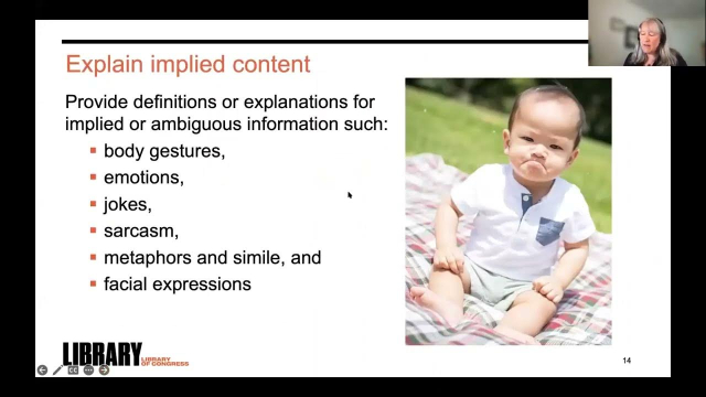
The art of designing and creating content to support people with cognitive disabilities lives in the space between usability and accessibility. This presenta...YouTube
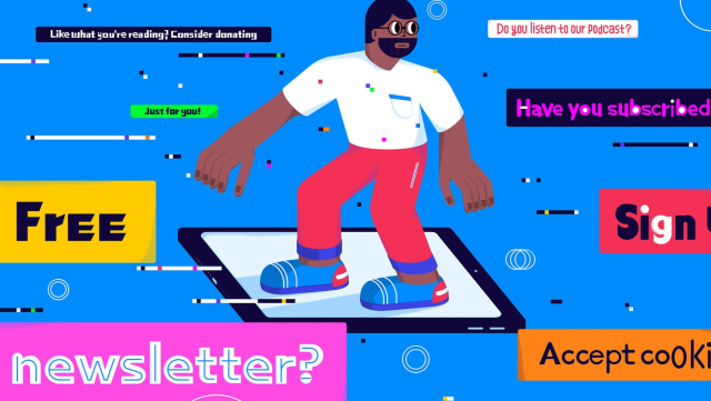
UI experts say pop-ups are a bad idea. So why is the “most hated” element of web design everywhere?s.e. smith (The Verge)
Personal website and portfolio for Brian DeConinck, a digital accessibility specialist.www.briandeconinck.com
It’s hard to believe even with an approximately 80% smartphone penetration globally, most apps are still not accessible. Most companies still deem accessibility-related use cases as “edge cases”, and…Ryan Tan (Bootcamp)

It’s important to consider the reduced-motion experience during design and development.Craft CMS

Wise Design is the Wise design system. It helps our team create a distinct, accessible and consistent Wise experience that works for everyone, everywhere.wise.design