Solution: just use a regular single input field, folks!
#accessibility #a11y #openweb #webdev #javascript #2fa #login #web #ux #usability #ui

For years, Single Page Applications (SPAs) built with frameworks like React have dominated the web development landscape. They promised fluid transitions, dynamic interfaces, and app-like experiences.Florian Thoma (Innoweb: Innovative Web Solutions in Sydney)

For years, Single Page Applications (SPAs) built with frameworks like React have dominated the web development landscape. They promised fluid transitions, dynamic interfaces, and app-like experiences.Florian Thoma (Innoweb: Innovative Web Solutions in Sydney)
I Want to Love Linux. It Doesn’t Love Me Back
fireborn.mataroa.blog/blog/i-w…
by @fireborn
Read this article! I promise this is not another “I’ve tried Linux but it is too hard” post but a very insightful and well-written piece on accessibility across the Linux landscape.
Thin Fonts Are a Usability Nightmare—And Finally, Designers Are Waking Up
webdesignerdepot.com/thin-font…
#UIDesign #webdesign #a11y #fonts #usability #accessibility #typography

Thin fonts may look sleek, but they’re a usability nightmare—hard to read, inaccessible, and especially frustrating on mobile.Noah Davis (Web Designer Depot)
In #Munich, the surface metro is called "S"-Bahn and the underground is the "U"-Bahn. There's this elevator on my way to work that has these three buttons: "O", "S" and "U". Which one would you pick to get to the "S"-trains when you're coming from the "U"-trains?
Over and over I've seen tourists with suitcases make the wrong choice in this elevator. It bothered me so much that I've printed a label to fix the #UX of this #usability disaster.
It's been there for 2 weeks now ✌️

Something I started doing lately is using the padding of a element to create the space between it and an instead of a margin or…Darin Senneff
My PhD student Sára and I are looking for people to participate in a study on usability aspects of interactive theorem provers. Please consider signing up!
Who? anyone who uses or has used an interactive theorem prover for whatever purpose
What? 90 - 120 minute interviews (possibly including a small think-aloud programming session)
When? interviews will be scheduled starting September 2024
Where? online (participants from anywhere are welcome)
We are hoping these interviews will help us determine how you interact with your theorem provers and to gain insights on how we can improve the user experience. We are interested in all aspects of interactive theorem provers, including but not limited to their design, their tooling, their libraries, and their documentation.
Sign up here: tudelft.fra1.qualtrics.com/jfe…
#Agda #Coq #Lean #Isabelle #Usability #TheoremProvers
The most powerful, simple and trusted way to gather experience data. Start your journey to experience management and try a free account today.tudelft.fra1.qualtrics.com
Please don't bloat web pages!
"Modern web bloat means some pages load 21MB of data - entry-level phones can't run some simple web pages"
tomshardware.com/tech-industry…
#webperf #webdev #webdevelopment #usability #sustainability

Danluu benchmarks numerous websites and discusses their impact on older and/or weaker hardwareChristopher Harper (Tom's Hardware)

A collection of bad practices in HTML, copied from real websites.Back to Basics: 5 HTML attributes for improved accessibility and user experience - HTMHell
About CSS prefers-reduced-transparency:
developer.chrome.com/blog/css-…
#UIDesign #CSS #usability #a11y

Optimize and adjust for users who prefer an opaque UI.Chrome for Developers
The problem with disabled buttons and what to do instead:
adamsilver.io/blog/the-problem…
Disabled buttons suck:
axesslab.com/disabled-buttons-…
#UIDesign #forms #usability #a11y #accessibility

Showing buttons as disabled until a form is complete might seem like a good idea. It is not. They usually create a lousy user experience and exclude many people with disabilities. Here's why disabled buttons suck and what to do instead.Hampus Sethfors (Axess Lab)
Modern Health, frameworks, performance, and harm
ericwbailey.website/published/…
"Performance, accessibility, and usability are more than inconvenient truths you can pretend don’t exist. They have a direct impact on the quality of someone’s life."
#webdev #webperf #ux #usability #a11y #uxd #webdesign

Performance, accessibility, and usability are more than just inconvenient truths you can pretend don’t exist. They have a direct impact on the quality of someone’s life…ericwbailey.website
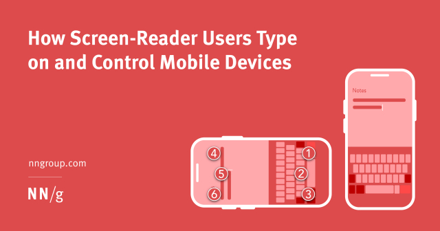
⌨️ Nielsen Norman Group research on how screen-reader users type on and control mobile devices
“Summary: Users who are blind or have low vision prefer dictation over typing with a keyboard whenever possible. Screen readers on touchscreen devices are restricted to a well-defined set of gestures which makes interaction more challenging than on computers.”
#accessibility #usability #mobile #lowVision #blind
nngroup.com/articles/screen-re…

Screen-reader users prefer dictation over typing with a keyboard. Screen readers on touchscreen devices are restricted to certain gestures which makes interaction more challenging than on computers.Nielsen Norman Group
Float labels may put you in the cool club, but they’re terrible UX.
It’s much better if your input’s label:
1) is legible
2) is above the input
3) doesn’t move about
4) is not mistaken for an answer
Simple > clever
-Adam Silver via Twitter

UI experts say pop-ups are a bad idea. So why is the “most hated” element of web design everywhere?s.e. smith (The Verge)

It’s important to consider the reduced-motion experience during design and development.Craft CMS

Learn how to create accessible links and text in your web content.Whitney Lewis (Pope Tech Blog)

The inputmode global attribute is an enumerated attribute that hints at the type of data that might be entered by the user while editing the element or its contents. This allows a browser to display an appropriate virtual keyboard.developer.mozilla.org

That’s how people behave on the web in 2023. Some observations from real usability testing on what people do and what they don’t do on the web. From disabled copy-paste to magic link sign-in.Smashing Magazine
Update: moved this to my new writing site so there’s a new URL.
Every hashtag on every post on every platform should always be pascal case. I wrote this to illustrate how screenreaders read hashtags based on their case.
It’s a small thing that all of us can do to build a more inclusive, accessible internet for all. Please take the time to use pascal case.
markwrites.io/hashtag-accessib…
#Accessibility #WebAccessibility #Usability #Readability #Hashtags #SocialNetworking #Blogging #UX

My post about hashtag accessibility on Mastodon (and later LinkedIn) got a lot of attention. There were so many replies from people who didn’t know about the a…Mark W.rites
Interesting open source alternative to #Calendly that I just DISCOVERED. Anyone know if it's accessible?
"Meet Cal.com, the event-juggling scheduler for everyone. Focus on meeting, not making meetings. Free for individuals."
#accessibility #usability #calendaring

Scheduling infrastructure for absolutely everyone. - GitHub - calcom/cal.com: Scheduling infrastructure for absolutely everyone.GitHub

That’s how people behave on the web in 2023. Some observations from real usability testing on what people do and what they don’t do on the web. From disabled copy-paste to magic link sign-in.Smashing Magazine

There are so many websites out there that have not considered the overall usability of their visually impaired users.Smashing Magazine
Web magazine about user experience matters, providing insights and inspiration for the user experience communityUXmatters
I have to say, that one little snag aside, that was the easiest/fastest operating system update I’ve ever performed on any operating system ever.