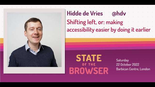
Hidde de Vries - Shifting left, or: making accessibility easier by doing it earlier
Hidde de Vries' talk from State of the Browser 2022https://2022.stateofthebrowser.com/speaker/hidde-de-vries/YouTube

Hidde de Vries' talk from State of the Browser 2022https://2022.stateofthebrowser.com/speaker/hidde-de-vries/YouTube

The open web's success is built on interoperable technologies. The ability to control animation now exists alongside important features such as zoomingEric Bailey (CSS-Tricks)

It’s important to consider the reduced-motion experience during design and development.Craft CMS

Wise Design is the Wise design system. It helps our team create a distinct, accessible and consistent Wise experience that works for everyone, everywhere.wise.design
Accessibility for designers: where do I start?
stephaniewalter.design/blog/ac…
#UIDesign #WebDesign #a11y #design #uxDesign
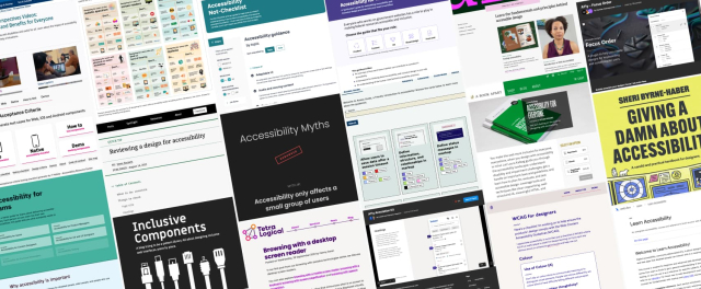
A big list of resources, articles, blog posts, and checklists to help you, designers, get started on your “building more accessible products” journey.Stéphanie Walter (Stéphanie Walter - Senior UX Designer, Mobile Expert, Conference Speaker, Blog writer and Teacher.)
Today's Web Design Update: groups.google.com/a/d.umn.edu/… Subscribe info: d.umn.edu/itss/training/online… #Accessibility #A11y #WebDesign
Featuring @yatil, @foiworkshop, @aardrian, @lloydi, @dennisl, @zachleat, @cferdinandi, @hdv, @codepo8, @matuzo, @homer, et al.
Web Design References: News and info about web design and development. The site advocates accessibility, usability, web standards and many related topics.www.d.umn.edu

We believe in working in the open. This blog is for designers across government to share their projects, ideas and concepts, or just to think out loud.designnotes.blog.gov.uk

Not getting enough traffic, conversions, or other online digital results you’re expecting? A fresh new look can do wonders for your brand’s online presence, the user experience, and even SEO.Ross Johnson (3.7 Designs, LLC)
With HTML alone there is no way to disable a hyperlink (an element), and have it be both exposed as a “link” and as “disabled”. Now, setting ...www.scottohara.me

Learn how to create accessible links and text in your web content.Whitney Lewis (Pope Tech Blog)
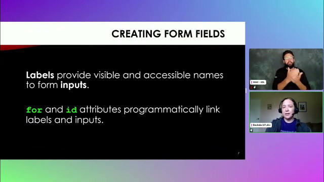
Forms have a strong semantic structure from labeling controls to ensuring the states of controls are announced by assistive technology. We look at the basics...YouTube

Outlines the current principles and work needed to improve the accessibility of the GOV.UK Design Systemdesign-system.service.gov.uk
Thanks to the wide support of the prefers-reduced-motion-media feature, we now have more advanced ways to design motion that can be creative and innovative while also being safer for those with motion sensitivities.Smashing Magazine
Today's Web Design Update: groups.google.com/a/d.umn.edu/… Subscribe info: d.umn.edu/itss/training/online… #Accessibility #A11y #WebDesign
Featuring @siblingpastry, hdv@front-end.social, @aardrian, @iheni, @dennisl, @WebAxe, @MerylEvans, @andy, @Kilian, @chriscoyier, @mgifford, @css__cafe@mastodon, @tink, @matthiasott, @matuzo, @Austingil, @cferdinandi, @gerrymcgovern, et al.
Web Design References: News and info about web design and development. The site advocates accessibility, usability, web standards and many related topics.www.d.umn.edu

If you want your text to be read, set it at a sufficient size! But what is a good font size, and how can you apply it in your web or app design? This article and video has answerers for you with some practical examples focused on body text in respons…Oliver (Pimp my Type)
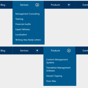
Early in 2017 I filed an issue against WAI-ARIA Authoring Practices (APG) requesting a change to the menu navigation pattern. Despite a great deal of feedback in agreement, it languished.Adrian Roselli
Users change browser or OS settings to improve their experiences for a reason. We should respect these decisions by writing CSS.Writing even more CSS with Accessibility in Mind, Part 2: Respecting user preferences
An approach that promised to democratize design may have done the opposite.Rebecca Ackermann (MIT Technology Review)
A blog post about modern CSS every day for 100 days.100 Days Of More Or Less Modern CSS

Say you’ve got this CSS and you need to set a nice, compact line height: h1 { font-size: 40px; } You open up the designer’s static design and it says the line height should be 44px. Easy peas…Andy Bell
So you’re saying there’s a chance … that I’ll make it to the footer. TL;DR (added 12 December 2020): Can the user hit “back” and return to the exact same place? Is there paging for when the JavaScript breaks? Does the page have a footer? Can a keyboa…Adrian Roselli
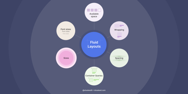
A modern look at responsive web design.Ahmad Shadeed Blog
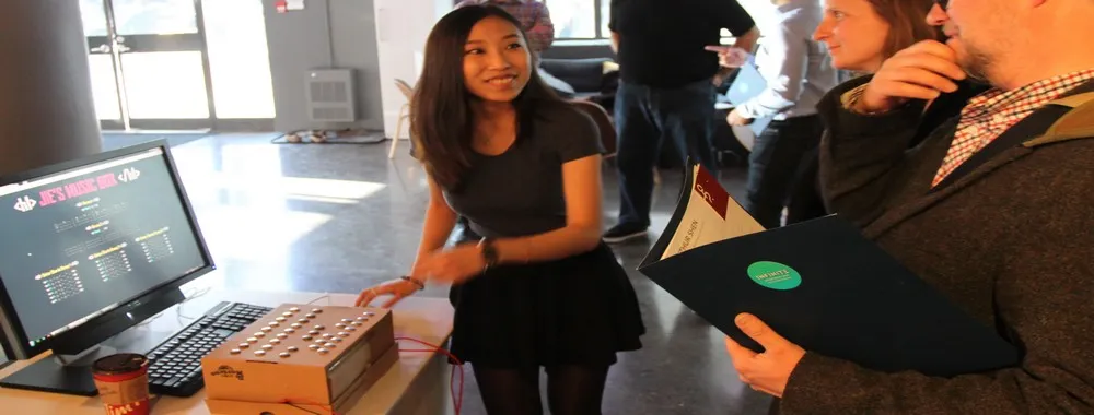
Accessibility can benefit your users and also improve the brand of your product. Learn how to plan for, and focus your efforts on, designing for accessibility.Ruby Zheng (Interaction Design Foundation)
We've collected about 400 examples in our hall of shame. The most commonly complained about companies are Google, Facebook, Amazon and LinkedIn.www.deceptive.design
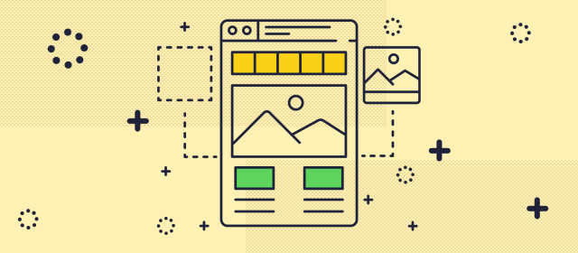
Learn how to take your wireframes one step further with annotations. We'll cover when & how to use them as well as how to prioritize what gets annotated.Ideas
Links are used on almost every site on the web, however it is easy to create links that are not accessible to all.www.a11yproject.com
Managing our colors can truly help people to access our content. In this article, Brecht de Ruyte takes a deep dive into how we can create a high-contrast system while maintaining a balance between designing something accessible and respecting the lo…Smashing Magazine

There is a huge and ever-widening gap between the devices we use to make the web and the devices most people use to consume it. It’s also no secretEric Bailey (CSS-Tricks)
Animations should be an enhancement, not critical to a user's understandingTatiana Mac

Thanks to the wide support of the prefers-reduced-motion-media feature, we now have more advanced ways to design motion that can be creative and innovative while also being safer for those with motion sensitivities.Smashing Magazine