Search
Items tagged with: dataviz
New blog post out (finally) ✨ I tested the dataviz accessibility of the 2024 presidential election dashboards, and (as expected) found a lot of issues to write about:
fossheim.io/writing/posts/2024…
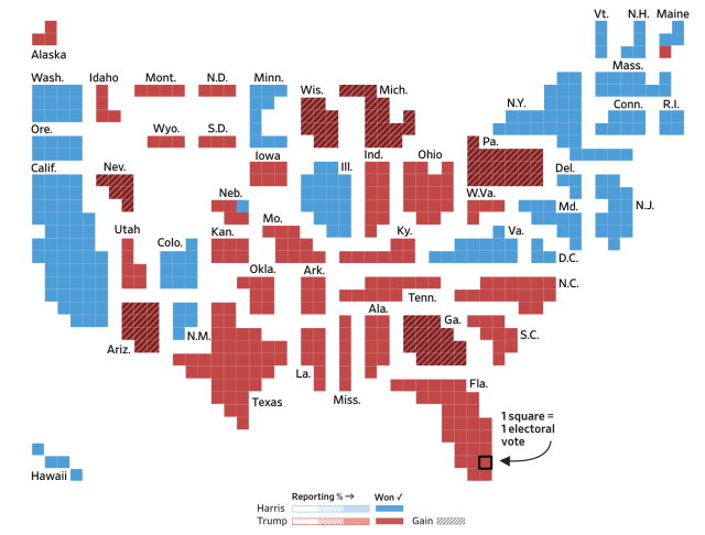
Dataviz accessibility principles, demonstrated by the 2024 presidential election dashboards. by Sarah L. Fossheim
I tested how well different election dashboards implemented common dataviz accessibility princples, and explained where things went wrong (including lots of demos).fossheim.io
If you're a #language nerd like I am, then you won't have missed the @mozilla #CommonVoice v19 #speech #dataset release - which now features 131 languages! Here's my #dataviz, done in @observablehq of the v19 #metadata coverage.
I've updated the visualisation this time around with human-readable language names instead of their ISO-639 or BCP-47 language codes to make it it easier to read.
There's some interesting observations:
▶ Catalan (ca) continues to be leader in terms of data - speaking volumes about the efforts to revitalise culture and language in Catalunya. It's also one of the few languages that has data for all age groups, particularly older speakers - this sort of data is missing for most other languages.
▶ Kiswahili (sw) is one of the languages where there is more data for female-identifying speakers than for male-identifying speakers ♀ - although Japanese (ja), Western Mari (mrj) and Luganda (lg) do pretty well here, too!
▶ Sentence domains can now be categorised, and although most new sentences are "general", Albanian (sq) has a lot of sentences related to law and government.
▶ Tsonga (ts), a Bantu language spoken in Southern Africa, has dethroned Icelandic (is) as the language with the highest average utterance duration. I don't know enough about Tsonga to speculate why - it's a somewhat agglutinative language, but many Tsonga works are generally short.
▶ Bengali / Bangla (bn) has a significant amount of data that is not yet validated, and therefore does not appear in training / dev / test splits. There is a similar case for many languages new to Common Voice - it takes time to validate.
▶ The language with the highest number of average contributions per speaker is Taita (dav), a Bantu language from Kenya.
What do you make of the data visualisation? Are there any other insights you can see?
Big thanks to the CV team for all their efforts - EM, Jessica Rose, Dmitrij Feller and Justin Grant.
A terrific 3-part series on colored blindness, accessibility, and data visualizations.
Part 1: blog.datawrapper.de/colorblind…
Part 2:
blog.datawrapper.de/colorblind…
Part 3:
blog.datawrapper.de/colorblind…
#a11y #webdesign #UIDesign #color #dataviz #colorblindness

What’s it like to be colorblind - Datawrapper Blog
'One notices being colourblind more often when looking at data visualizations': Ten experiences.Lisa Charlotte Muth (Datawrapper Blog)
Making data visualizations accessible - TPGi
Data visualizations aim to make information easier to understand through visual presentation, but they can have specific accessibility implications for people with disabilities.Ricky Onsman (TPGi)
The focus on Freedom and taking control of your data is also imperative to #LabPlot, an open source Data Analysis and Visualization software.
It supports multiple file formats and the ODS import support will be added in the next release 
➡️ invent.kde.org/education/labpl…
#LibreOffice #DataViz #Plotting #FLOSS #FOSS #OpenSource
#DataScience #Spreadsheet #Calc #ODS

Ods import support (!369) · Merge requests · Education / LabPlot · GitLab
Description Support importing ODS (Open Document Standard) files produced by Calc, etc. ConformityGitLab
An interesting experiment in turning 💯 data and 📈📊📉 graphs into 🔊 audio.
“… one aim is to make our data journalism more #Accessible for vision-impaired people.”
theguardian.com/news/datablog/…
#DataViz
#Accessibility / #A11Y
#Inclusion

What is the sound of Facebook’s value crashing? Noisycharts turns news into noise
Rising carbon dioxide and the slump in the pound have been frequently graphed. Now we’ve turned the data and graphs into audioNick Evershed (The Guardian)
#introduction time 👋
- I'm a writer, programmer and researcher based in Melbourne.
- My day job involves a lot(!) of #dataviz and my main tools of the trade are #d3js, #python, #R and #GIS software. But I also play around with p5.js and SQL on occasion.
- Outside of that, I'm looking to learn more about digital librarianship and curatorship, digital humanities, early internet and the #indieweb, live art coding, generative art and cool web design.
- I was also a #music journalist for a few years and I'm a classically trained singer, so I'm always keen to hear new recs
✌️
