
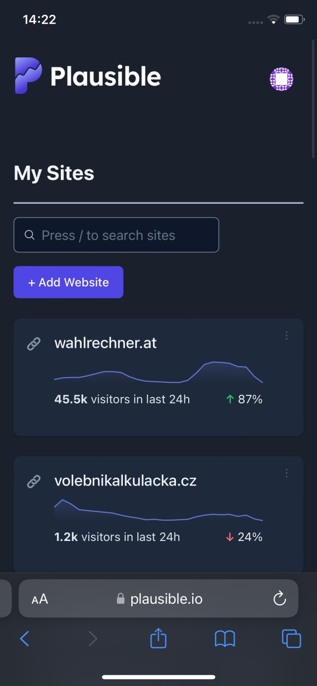
Talk about a grotesque invasion of privacy:
"Smart TVs from Samsung and LG take screenshots of what you are watching even when you are using them to display images from a connected laptop or video game console"
newscientist.com/article/24491…
How can this possibly be legal?
Here's why: Congress isn't just indifferent to your privacy. It is actively complicit with big corporations -- and law enforcement -- in embedding surveillance into everything we do.
This entry was edited (1 year ago)


 mohou byt uctovany nad ramec vaseho tarifu, vice se dozvis na http://mobileinfo.cz. Mas zapnutou sluzbu Data roaming limit. Vice o cenach ziskas na +420735010357 (zdarma). Uvedene ceny jsou s DPH. Kaktus")


, tinted windows (a reasonable practice for any medical facility concerned with patient privacy), high power usage (as any diagnostic facility), the alleged odor of cannabis plants (in a busy shopping plaza with no prior reports), the absence of a cultivation permit (which no diagnostic healthcare facility would possess), and the presence of two men wearing identical company-branded shirts (unexpected of individuals involved in illegal cultivation), OFFICER FRANCO found probable cause for cannabis cultivation at the TARGET PREMISES")


Seirdy
in reply to Seirdy • • •i mean, think about it. the defining difference between UI design pre- and post-Metro/Material/iOS 7 is how easy it is to use office suite shape tools to prototype a UI.
i don’t think this theory is true but i want it to be since it explains everything.
Seirdy
in reply to Seirdy • • •notable exception: modern Google app icons are impossible for stereotypical PMs or good designers to dream up. a special third type of fucked-up creature was brought in.
someone at Google let the authors of their technical writing style guides write the icon design guidelines.
Seirdy
in reply to Seirdy • • •ok I think I made a joke that was just for me.
Google’s technical writing in practice isn’t actually that bad. the things the style guide chooses to be opinionated and lax on are just a bit odd. very lax on ambiguous terminology but opinionated about using contractions.
the joke I was going for was that the official app icons give me that exact vibe. very ambiguous, very different styles, yet somehow too coherent. it’s actually a bit unsettling.
Meet, Chat, TV, even Calendar: all empty rainbow squares that look the same. Prioritizing similar aesthetics over uniqueness.
Yet most older apps with an existing brand not tied to their empty-rainbow-outline icon guidelines seem recognizable: Classroom, Earth, Voice, YouTube (different palettes, not empty shapes). But some of these will likely join the graveyard of abandoned Google products.
New silly conspiracy theory: Google sunsets old products so they can be replaced by products with icons conforming to its newest icon guidelines.
Alice
in reply to Seirdy • • •Seirdy likes this.
Seirdy
in reply to Alice • • •Alice
in reply to Seirdy • • •I mean yeah, some icons are just bad
but e.g. from GNOME perspective that was absolutely the right move. At one point we had icons like this: 3.bp.blogspot.com/-UBhifwD1gzU…
Well, that's an idealistic lie. In reality, they were like this: news-cdn.softpedia.com/images/…
See, only about 3 people in the entire world knew how to draw icons in that specific style and it tooks weeks to make a single icon. Yeah, there were guidelines, but it's way too elaborate for anyone to bother, and so no one did. Every single third party app (except those jimmac/etc made an icon for personally) had crappy icons. I mean corebird on the second screenshot is actually a GNOME app.
So, we drastically simplified icons and made them very geometric, as well as got rid of all the 5 or 6 different sizes and just have a single svg per app. Result? Even the less polished apps have reasonable looking icons. I mean look at this: apps.gnome.org/ - there isn't a single app with a crappy icon there. (ok ok, being in circle already implies a baseline level of quality, but take a look at apps designed for gnome on flathub and it's same story there)
Same story for symbolics - some people were pissed that GNOME uses symbolic icons for apps instead of tango style, but like? I'm not an artist at all, and yet I managed to draw a bunch of these icons for highscore just fine. Previously I'd have to ask a designer.
And well - same for UI styles. Yeah, iOS 6 apps looked very very elaborate, but good luck doing that without an artist. The barrier of entry is so so much lower without an expectation that your app will use wood/leather textures (which were not a part of the platform btw! it was a custom thing in each app, unlike Mac OS X brushed metal)
Seirdy
in reply to Alice • • •@alice yeah i was thinking about like. official apps and components that progressively simplify the design at the expense of usability.
Apple honestly didn’t do nearly as badly here as MS did, but at least MS supports WHCM to put bring borders back so I can identify boundaries between components.
I’m biased. I really struggle with identifying boundaries without prominent borders or gradients, remembering icon purposes, etc. so I’ve mostly been noticing years of regressions that I’ve had to theme away.
Seirdy
in reply to Seirdy • • •