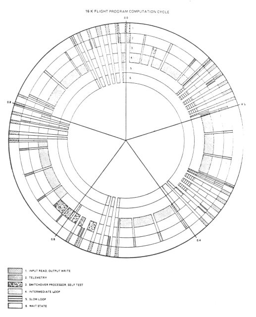
Ran across this gorgeous diagram (at left) of the cyclic execution schedule of the software used on Skylab (1970s). I love this way of thinking about cyclic execution, but I didn't realize anyone else used it!
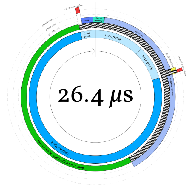
At right, one of my (less pretty and much less hand-drawn) diagrams from an article I wrote on graphics demo architecture... 40 years later. (And ten years ago, gosh.)
In the replies below, I talk about the old ways of drafting, if you're curious.













cliffle
in reply to cliffle • • •One of my favorite parts of the Skylab drawing: it's clearly hand-drawn.
It's _very well_ hand-drawn, of course, but there are tells. Note that the sector dividing lines don't meet in a point in the center, for instance -- this is because the dividing ruler was centered, so the lines are offset by one pen width, creating a tiny pentagon where the lines intersect.
Also, note that the fill patterns are not always at the same angle, but rotate. This is not how tool-generated fills work -- they're usually in a global coordinate system -- but is very much what you get when doing fills by hand with a guide.
cliffle
in reply to cliffle • • •There's also some mild kerning inconsistency, which strongly suggests that the lettering (in Futura medium, naturally, this was the Space Age after all) was done with a dry transfer lettering sheet, or _potentially_ with a template guide at very large scale. But my money's on dry transfer.
Dry transfer lettering is a thing I'm _just_ old enough to have learned about in drafting class. For those of you who learned to draw post-computer, let me introduce you to Letraset:
en.wikipedia.org/wiki/Letraset
Again, the artist was clearly a pro: the baselines are impeccable and the keming in general is near-perfect. But not machine-perfect. Which I like.
type foundry company originating in the UK
Contributors to Wikimedia projects (Wikimedia Foundation, Inc.)Federico Mena Quintero
in reply to cliffle • • •