Search
Items tagged with: UIDesign
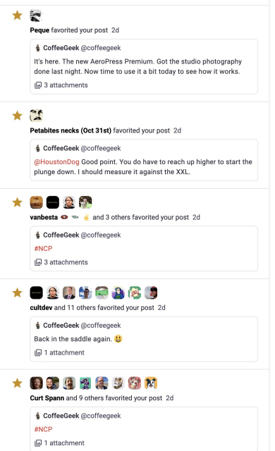
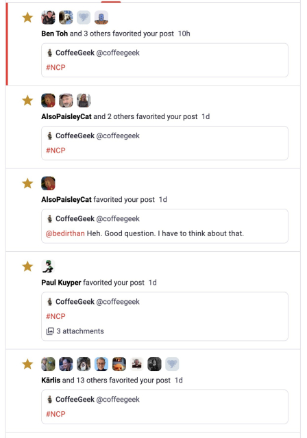
I'm just going to say it. Whoever designed the new notifications layout and design for Mastodon needs to go back to the drawing board (and UI design school). In some cases, esp if you start off with a tag, it looks and works horribly. (desktop view). Way worse than the old way just a month or two ago.
#mastodon #fediverse #design #uidesign
1 year ago I switched from Mac to Linux for professional UX design work. In this article, I explain as simply as possible:
- Why I switched to Linux
- How you can do the same.
I cover design-specific concerns like:
- How to use Apple devices like the Magic Mouse in Linux
- Which design tools are available and how to install them
- How to find help if you get stuck
chris-wood.design/resources/li…
#Design #UXDesign #UIDesign #Linux #MacOS
Linux for UX Designers - What I learned after a year of doing design work on Linux
My experience with moving from Mac to Linux for professional UX and UI design work and how to make the switch yourself.Portfolio
Getting To The Bottom Of WCAG-Conformant Interactive Element Size
smashingmagazine.com/2024/07/g…
by @eric
#a11y #wcag #webdesign #UIDesign
Getting To The Bottom Of Minimum WCAG-Conformant Interactive Element Size — Smashing Magazine
WCAG provides guidance for making interactive elements more accessible by specifying minimum size requirements.Smashing Magazine
Dark mode & accessibility myth
stephaniewalter.design/blog/da…
#darkmode #a11y #accessibility #webdesign #webdev #UIDesign
Dark mode & accessibility myth by Stéphanie Walter - UX Researcher & Designer.
Dark mode isn't always better for accessibility, you need to let users chose. And if you build a dark theme, make it accessible!Stéphanie Walter (Stéphanie Walter - Senior UX Designer, Mobile Expert, Conference Speaker, Blog writer and Teacher.)
Do you want to help make AntennaPod ready for the future? And do you have experience (or talent) in the domain of UX and/or UI design?
We're looking for folks to help us with embedding new innovative features on our player screen!
All details & contact options here👇
opensourcedesign.net/jobs/jobs…
#OpenSourceDesign #UX #UI #FOSS #OpenSourceContributions #Penpot #wireframes #volunteer #SummerProject #UXdesign #UIdesign
Made good progress this weekend on #IconBear , my upcoming open-source icon manager for Linux.
* Install pre-packaged icon sets to quickly start building your library.
* Icons are automatically categorised as "Outline", "Filled", "Duotone" or "Color" when you import them.
* Icons are loaded asynchronously, for improved performance.
Once work on importing, deleting and filtering sets is finished, I'll be looking to release the app 🙌
Now we're wondering: might we find among you (or your network) two experienced UX/UI designers who are willing to engage in a 6-month volunteer project? We need to come up with a way to fit a bunch of new functionality into the already busy player screen. We're looking for two people (one for each role) to help us with this.
Interested? More info? Send a DM or email keunes@mailbox.org.
Boosts appreciated!
#UXdesign #UIdesign #OpenSource
heather-buchel.com/blog/2024/0…
by heather buchel #a11y #UIDesign
A letter to my younger self, as an accessibility advocate
All of the things I get to say "I told you so" about, now.heather-buchel.com
Making data visualizations accessible - TPGi
Data visualizations aim to make information easier to understand through visual presentation, but they can have specific accessibility implications for people with disabilities.Ricky Onsman (TPGi)
A terrific 3-part series on colored blindness, accessibility, and data visualizations.
Part 1: blog.datawrapper.de/colorblind…
Part 2:
blog.datawrapper.de/colorblind…
Part 3:
blog.datawrapper.de/colorblind…
#a11y #webdesign #UIDesign #color #dataviz #colorblindness
What’s it like to be colorblind - Datawrapper Blog
'One notices being colourblind more often when looking at data visualizations': Ten experiences.Lisa Charlotte Muth (Datawrapper Blog)
Designing better target sizes
An interactive guide on designing better target sizes on the web.ishadeed.com
Placeholders in Form Fields are Harmful
Data-entry form fields on websites are crucial for ecommerce and many other applications. Fields need labels and (sometimes) instructions, but placing this t...YouTube
Explore IBM Design’s approach to designing for sustainability -- link to PDF white paper including design checklist for sustainability 🌎
ibm.com/design/practices/desig…
#IBM #design #UIDesign #sustainability #environment #goGreen
IBM Design
At IBM, our design philosophy is to help guide people so they can do their best work.www.ibm.com
In Loving Memory of Square Checkbox
History of checkboxes and radio buttons in user interfacestonsky.me
Understand UX - UX Dictionary
Learning about UX? Or working with UX professionals? Find out what they're talking about in this community-built UX dictionary.UX dictionary
Designing better target sizes
An interactive guide on designing better target sizes on the web.ishadeed.com
16 Lesser Known Accessibility Issues [and Tips]
toward.studio/latest/16-lesser…
"12. Don’t hide labels. Ever."
#a11y #accessibility #webdev #webdesign #tips #UIDesign #forms
16 Lesser Known Accessibility Issues | Toward
In this post Matt discusses 16 accessibility issues and solutions we've encountered while building a bi-lingual website application for a public sector…Toward Studio
A beginner's guide to accessible text - Pope Tech Blog
Learn how to create accessible text in your web content.Whitney Lewis (Pope Tech Blog)
Accessibility Tools and Resources for Designers • DigitalA11Y
A comprehensive list of accessibility tools and resources for designers to achieve accessibility from start.Raghavendra Satish Peri (DigitalA11Y)
Creating Accessible UI Animations — Smashing Magazine
Animation and accessibility are often seen as two separate powers at odds with one another. How is it possible to strike a balance between elements that move and the possible negative effects they expose to users who are sensitive to motion? Oriana G…Smashing Magazine
Related: 4 examples of web-accessible date pickers...
WAI: w3.org/WAI/ARIA/apg/patterns/d…
Deque: dequeuniversity.com/library/ar…
U.S. Web Design System
designsystem.digital.gov/compo…
Tommy Feldt: fymmot.github.io/inclusive-dat…
#date #calendar #UIDesign #webdesign #webdev #a11y
Date Picker Dialog Example
Accessibility resources free online from the international standards organization: W3C Web Accessibility Initiative (WAI).W3C Web Accessibility Initiative (WAI) (Web Accessibility Initiative (WAI))
About CSS prefers-reduced-transparency:
developer.chrome.com/blog/css-…
#UIDesign #CSS #usability #a11y
CSS prefers-reduced-transparency - Chrome for Developers
Optimize and adjust for users who prefer an opaque UI.Chrome for Developers
The problem with disabled buttons and what to do instead:
adamsilver.io/blog/the-problem…
Disabled buttons suck:
axesslab.com/disabled-buttons-…
#UIDesign #forms #usability #a11y #accessibility
Disabled buttons suck
Showing buttons as disabled until a form is complete might seem like a good idea. It is not. They usually create a lousy user experience and exclude many people with disabilities. Here's why disabled buttons suck and what to do instead.Hampus Sethfors (Axess Lab)
UX Principles that include Cognitive Accessibility
A Cognitive perspective on UX Design Principles including a neurodivergent perspective with links to relevant guidance and resources.www.ab11y.com
4 design principles I use every day to avoid bad UX and create products that work for everyone (by Adam Silver)
adamsilver.io/blog/4-design-pr…
Principle 1: Good design works for everyone
Principle 2: Good design makes things obvious
Principle 3: Good design puts users in control
Principle 4: Good design is lightweight
#UXDesign #UIDesign #webdesign
4 design principles I use every day to avoid bad UX and create products that work for everyone
Adam Silver – interaction designer - London, UKAdamsilver.io
The 7 Principles
The 7 Principles on the Centre for Excellence in Universal Design website.universaldesign.ie
The problem with input masks and what to do instead
Adam Silver – interaction designer - London, UKAdamsilver.io
The problem with automatically focusing the first input and what to do instead
Adam Silver – interaction designer - London, UKAdamsilver.io
Designing services for people who need help with numbers
Low numeracy affects half of adults in the UK. Many live with the limitations of not understanding numbers and the impact that has on everyday life.Accessible Numbers