Apple's Liquid Glass is the all-time greatest advertisement for Apple's accessibility settings.
Search
Items tagged with: ux
✔ Say you search for something and there's a list of smart results.
You have a toggle that enables something like 'strict keyword matching' - which means any result not having those keywords will be dealt with.
👀 Catch: Keep in mind that often search results can be indirectly related to what you looking for without containing those keywords.
Question is, how would you like them dealt with?
#askfedi #userresearch #ux #ui #linux #youtube #google #browsers #webdev #enshittification #firefox #chrome #writing #cooking #accessibility
- Lowered opacity (14%, 1 vote)
- Border around to show who's the odd one out (14%, 1 vote)
- Completely removed (57%, 4 votes)
- Other (please comment) (14%, 1 vote)
Solution: just use a regular single input field, folks!
#accessibility #a11y #openweb #webdev #javascript #2fa #login #web #ux #usability #ui
Question for the Mastodon hive mind:
Primer:
I have a need to convert, resize, reorient, and transcode video for various stages of our video edit and distribution pipeline. I've been doing all of this in ffMpeg, via command line arguments and custom-coded scripts. However, the needs of this thing just simply don't scale that way. And no one but me gets access to the CLI on these systems. So that's just not feseable.
Now finally, to the question.
I am looking for an open-source web frontend to ffMpeg that is, if not fully accessible, as that is a very tall order, but at least usable by an experienced screen reader user with the typical tools and hacks learned over twenty years of experience. Just something that doesn't make accessibility a barrier and most importantly, a time waster.
Please boost far and wide for reach, with thanks.
Ready! Set! Fire!
#A11Y #Accessibility #ffmpeg #web #Interface #WebUI #UI #UX
As privacy is kind of implied, the next most important thing for me would be #UX
Ultimately, the user experience would be key in deciding how well the phone gets adopted by the public.
My Ubuntu Summit talk is up! Where I talk about:
1. How Desktop UX is effectively dead
2. Why I hate the term UX/UI with the heat of 1000 suns
3. How OSS can actually innovate in #ux
youtube.com/watch?v=1fZTOjd_bO…

Are we stuck with the same Desktop UX forever? | Ubuntu Summit 25.10
This talk focuses on that evil little term “UX/UI,” which is responsible for so much confusion and tension in open-source projects. Not only does it unnecess...YouTube
Welcome Dan Williams, new LibreOffice Developer focusing on UI/UX - The Document Foundation Blog
The Document Foundation is the small non-profit entity behind LibreOffice. It oversees the project and community, and is now expanding with new developer roles.Mike Saunders (The Document Foundation)
Today we bring you significantly better scrolling performance in GNOME Calendar's month view. It no longer lags on my PC!
gitlab.gnome.org/GNOME/gnome-c… is mostly solved with a combination of Georges' gitlab.gnome.org/GNOME/gnome-c… and @TheEvilSkeleton's gitlab.gnome.org/GNOME/gnome-c….
Enjoy it in Nightly, or @gnome 50.
This is why I use a 16-years-old PC as my main development machine: it forces you to solve every performance issue, instead of throwing faster hardware at the problem.
#GNOMECalendar #UX #GNOME
With mousewheel scrolling, infinite scroll may be a bit laggy on some computers (#1125) · Issues · GNOME / gnome-calendar · GitLab
On my desktop workstation machine, GNOME Calendar 45+'s month view scroll animation can be a bit slow: It feels like 20-25 fps rather than...GitLab
First MR merged in the currently happening GNOME Calendar livestream: gitlab.gnome.org/GNOME/gnome-c…
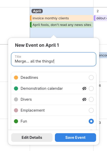
It's already available in the current nightly flatpak version. It is so nice to be able to use the new event quick-add popover, with no extra swirly pages etc. to pick the target calendar. Very efficient! 😌
Thanks to @TheEvilSkeleton for their patience and sisyphean rebasing of that much awaited merge request over the past 2 years 🫡
4 tickets have been closed as a result!
#GNOMECalendar #GNOME #UX
quick-add-popover: Port to libadwaita widgets and merge stack pages (!362) · Merge requests · GNOME / gnome-calendar · GitLab
Both stack pages are merged into one, to avoid additional clicks. Mnemonics were added to accommodate keyboard users as well. ClosesGitLab
All I want from #Mozilla is for them to improve* the damn bookmarks organizer dialog (the one that shows up with Ctrl+Shift+O) & bookmark popover in #Firefox, but instead I get an opt-in hallucination engine that I'm never going to use  : blog.mozilla.org/en/firefox/ai…
These, instead, are the kind of improvements I want:
* bugzilla.mozilla.org/show_bug.…
* bugzilla.mozilla.org/show_bug.…
* bugzilla.mozilla.org/show_bug.…
* bugzilla.mozilla.org/show_bug.…
* bugzilla.mozilla.org/show_bug.…
* bugzilla.mozilla.org/show_bug.…
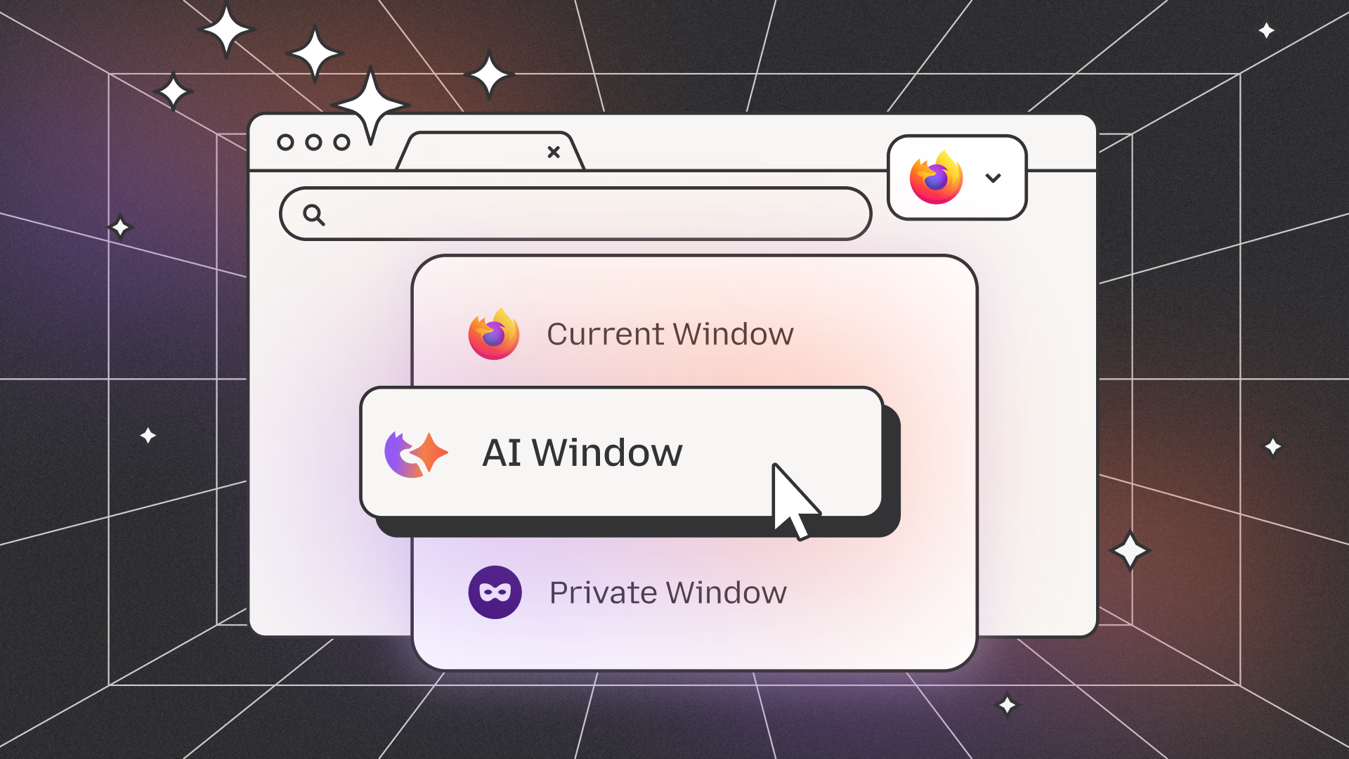
Introducing AI, the Firefox way: A look at what we're working on and how you can help shape it
AI Window is a user-controlled space we’re building in Firefox that lets you chat with an AI assistant and get help while you browse.Kristina Bravo (The Mozilla Blog)
youtube.com/live/WvNgMEumSoA?t…

Ubuntu Summit 25.10 | Day Two
🌍 Join us and shape the future of open source.Ubuntu Summit 25.10 is a showcase for the innovative and the ambitious. We invite all experts, builders, engin...YouTube
I keep getting pushback on this but I'm gonna to keep saying it: We're NEVER going to free people from the clutches of Big Tech until we realize & respect that most computer users by far aren't actually computer users.
They don't give a shit about computers. They don't want to see a single line of code, ever.
They don't care about customization, "distros" or versions. They don't care about GUIs or desktop environments.
They just want to get to what they're doing; work or play.
I've been thinking about creators and distributors. picture a woodworker who crafts a perfectly balanced, minimalist chair. a furniture store loves it and starts selling it. but, to "match their brand", the store paints every chair bright green
customers see a green chair. they don't know the store painted it. they just assume the original artisan loves making bright green chairs. the creator's original intent and aesthetic are completely lost in translation, and their reputation is now tied to a choice made by someone else
this happens so often in FOSS. upstream developers create the "wooden chair", and downstream distros often paint it "green". there's nothing inherently wrong with that, but it creates a gap where users blame the artisan for the paint job. it makes you think about where creative ownership truly lies
#FOSS #OpenSource #Philosophy #UserExperience #UX #Upstream #Downstream #DigitalOwnership
For the next GTK cycle, Matthias has been working on a format for symbolic icons that can be rendered efficiently by GTK, including animations; it is based on a subset of SVG with custom vendor attributes:
discourse.gnome.org/t/animated…
If you want to experiment with content creation apps, or towards a shared implementation, feel free to drop by on Discourse.
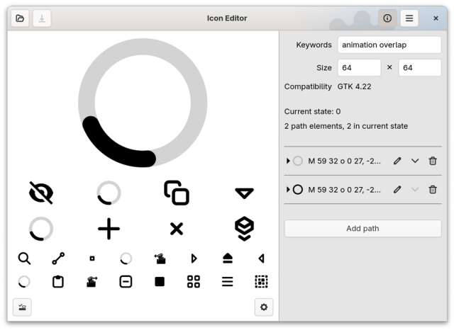
Animated icons for GTK
I have been working for a while on GTK support for stateful, animated, symbolic icons. This post is meant to provide an introduction to the format, and encourage experimentation with it. The code will land very soon in GTK 4.21.GNOME Discourse
jenson.org/hype/
knowaboutaccessibility.org/202…
#webdesign #UIDesign #ux #UXDesign #a11y

5 simple fixes that make digital spaces calmer—for neurodivergent and all users.
By Lē Silveus — When we talk about accessibility, most engineers think of screen readers, alt text, and color contrast. These are essential, but they’re only part of the picture. Digital spaces mus…Know About Accessibility
👁️ super short note: placeholder perfidy
"I made the mistake in a recent article of using the placeholder attribute content to illustrate when a label is not correctly associated the text label does not provide an accessible name."
#accessibility #HTML #UX
“Check / Uncheck all in a Table”
adrianroselli.com/2025/07/chec…
TL;DR: Unless you have user testing results saying otherwise, maybe put a check-all checkbox outside the table.
The rest of this thread has video examples…
[1/4]
#UX #HTML #accessibility #a11y
Apple’s ‘liquid glass’ contrast hilarity is now a bullet on my post “I Don’t Care What Google or Apple or Whoever Did”
adrianroselli.com/2020/03/i-do…
Please please PLEASE do not copy Aero, er, Glass in your Figmas.
#accessibility #a11y #UX
I Don’t Care What Google or Apple or Whoever Did
Please do not use this post as an excuse to beat up the devs at Apple or Google. If you are doing that, you have missed the point of this post and you are being unnecessarily mean to individuals who may have no control over broader organizational dec…Adrian Roselli
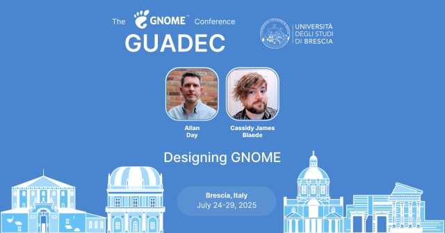
🎨 "Designing GNOME"
with Allan Day & Cassidy James Blaede
📅 24 July 🕒 11:05 CEST 📍 Brescia
🖌️ A year of design updates: notifications, UX patterns, Adwaita fonts & more.
🔗 events.gnome.org/event/259/con…
#GNOME #UX #Design #Adwaita #GUADEC2025
GUADEC 2025
Welcome to GUADEC 2025 GUADEC is the GNOME community’s largest conference, bringing together hundreds of users, contributors, community members, and enthusiastic supporters for a week of talks and workshops.GNOME Events (Indico)
Inclusive Design for Accessibility: A Practical Guide to Digital Accessibility, UX, and Inclusive Web & App Design
packtpub.com/en-us/product/inc…
#books #book #a11y #accessibility #ux #webdesign #UIDesign

Inclusive Design for Accessibility | Web Development | Paperback
A Practical Guide to Digital Accessibility, UX, and Inclusive Web & App Design. Top rated Web Development products.Packt
In #Munich, the surface metro is called "S"-Bahn and the underground is the "U"-Bahn. There's this elevator on my way to work that has these three buttons: "O", "S" and "U". Which one would you pick to get to the "S"-trains when you're coming from the "U"-trains?
Over and over I've seen tourists with suitcases make the wrong choice in this elevator. It bothered me so much that I've printed a label to fix the #UX of this #usability disaster.
It's been there for 2 weeks now ✌️
Who's Afraid of a Hard Page Load?
Single-Page Applications (SPAs) are a worse user experience.Unplanned Obsolescence
I recently drove a car whose whole control and entertainment system was a gigantic iPad-like thing mounted to the dash. It caused me to have a realisation about the #Ui and #UX of touch screens.
There is no way to touch a touchscreen without it treating that touch as intentional. What I mean is: without taking my eyes off the road, I can grope across the dashboard, find a knob or button—by touching it—without activating any function. Touching the volume button or temperature knob doesn’t DO anything until I do it with more force and intentionality. Not so for a #touchscreen.
My mobile #phone (an #iPhone 13) has no dead space in its face. There’s no part of the phone face I can touch without it assuming I meant to do that and I wanted to activate whatever was under my finger. Old iPhones that had physical home buttons also had dead space to either side: a safe space to hold the phone without DOING anything.
Computer keyboard have little raised pips on the F and J keys so you can find them by touch without looking. I do this all the time. But I don’t type the letters F or J. Touch screens have no such affordances.
I look at the #blackberry keyboard in this photo and I see a raised space bar. It’s an #affordance that lets you orient your fingers, and orient how you hold the phone, without looking.
I miss buttons.
mobilesyrup.com/2025/02/15/bla…

BlackBerry's iconic keyboard patent has expired
Let's all close our eyes and go back to 2009 so we can feel the thrill of typing our first email on the go.Brad Bennett (MobileSyrup)
This is what I think about whenever infosec wonks on here start telling people they should use matrix or xmpp+omemo or whatnot instead of signal
To be fair, I understand the arguments and to a large extent I agree with the critiques. However, I think anyone making these recommendations is vastly underestimating the capacity or appetite for most people to deal with the user experiences presented by these alternatives.
User experience is the ultimate force multiplier. For anything that requires network effects to function (ie most anything involving communication), if it doesn't *just work* then you've lost 90% of your audience.
#matrix #xmpp #infosec #cybersecurity #signal #ux #design #ui #encryption #privacy #crypto
Soon, on a daily release near you...
#UX #usability
📣 ✍️ New #webdev blog post!
This one is special to me, partly because it took some time to cook 😅 , partly because I talk a bit about #ux (which is not my main field), and partly because it features an experiment: after talking about #webpush and #pwa with #django, I'm asking my dear readers (you 😉) to visit a small demo website and tell me how it went!
You can give feedback here, or on Lemmy, Lobsters, etc. I'll update the post with the links!
So here it is: david.guillot.me/en/posts/tech…
Enjoy! 😸🔔

Push notifications without a mobile app: an experiment (with Django)
Today I want to talk to you about a combination of technologies that I don’t see often implemented, yet I wonder why: Web Push Notifications and Progressive Web Apps.David Guillot
We're back for a new season!
Kicking off "Season 3" of UX Podcast @axbom and @Beantin bring you a topic show. In this episode we dive into the concept of "Dark mode", its benefits, and its implications for UX design, user experience and accessibility.
#ux #a11y #uxpodcast #podcast #uxdesign #userexperience #accessibility

Dark mode - UX Podcast
We take a dive into dark mode. What it is and why it's no longer a nice-to-have feature.UX Podcast
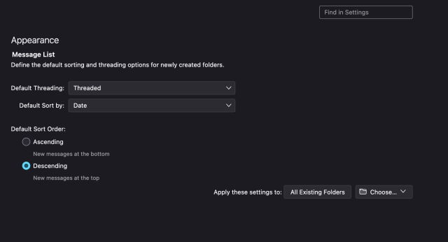
And @Mozilla and @thunderbird keep ignoring it. #thunderbird #ux #email #linux
'thunderbird.tmp' folder in '~/Download' directory?
Thank you for your reply. I did some internet search and found that many other snaps are also affected by this “design”, most notably Firefox. There they also had endless debates about $DOWNLOAD/firefox.tmp.snapcraft.io
The evolution of #LEGO computer #UX design:
interactionmagic.com/UX-LEGO-I…
The UX of LEGO Interface Panels
LEGO interface panels are beautiful, iconic, and great for learning interface design basics. I bought 52 of them from BrickLink to explore the design, layout and organisation of complex interfaces.interactionmagic.com
This is an embeded video on a random page.
Yeah, I use #firefox containers, and everything google related is opening in one specific container to limit their spying on me. I opened the page in different container, thus I am not signed in.
Well ok, give me the link to the youtube video and I will watch it there? In the right container?
Youtube UX: no link to the video, but here you can watch some different stuff...
Just found this article stating that using the #language #attribute for individual words within a text is not a good idea when you want #ScreenReader users to have a good #UX. It's just overengineered #a11y.
I'm a bit surprised as you always read otherwise (as the article also mentions).
Are some screen reader users here that can share their experiences? I'm really curious now 🤔
netz-barrierefrei.de/en/lang-a…
How the Language Attribute is demaging Accessibility - Accessibility Consulting - Training & Support
The language attribute seems to make sense for accessibility, but only for sighted people.www.netz-barrierefrei.de
Reminder: new home for the Inclusive Design Principles
inclusivedesignprinciples.info… the old domain has lapsed and now advertises gambling 😑
In just a few minutes, Inclusive Design 24 will be getting underway... 24 hours of #free talks about everything related to inclusive design:
inclusivedesign24.org/2024/
#accessibility #design #code #UX #XR #gaming #disability #a11y #id24
Authentication is almost always the most frustrating step of interacting with a service. Matrix is no different, but Quentin is about to dramatically improve the situation.
Get a glimpse of all the goodness awaiting to be unlocked once his project lands!


