Search
Items tagged with: UX
I remember longing for proper skipping of descenders in #CSS. Now that skipping is default in most browser I’m often struck by how *terrible* it is for hyperlink legibility.
The first line in the image shows a linked line with text-decoration-skip-ink set to "auto".
The second line shows the same linked line with text-decoration-skip-ink set to "none".
Just by looking at the first line, you can’t say if it is multiple links or or not.
Perhaps something for @Seirdy.
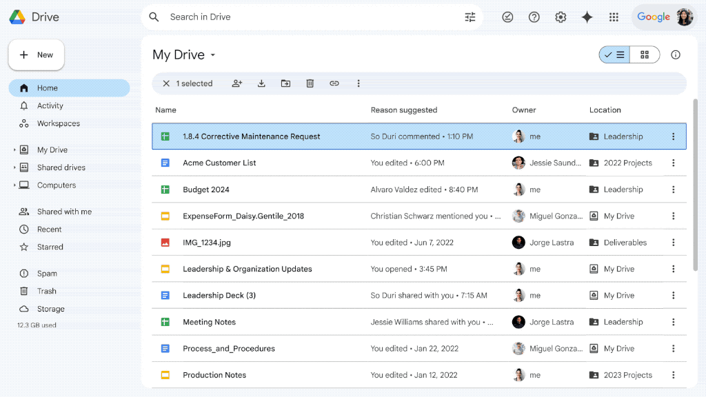
I believe this is the first of its kind implementation on the web, i.e. first-letter navigation, so kudos to the Drive team! :) #accessibility #ux unmute.community/@payown/11236…
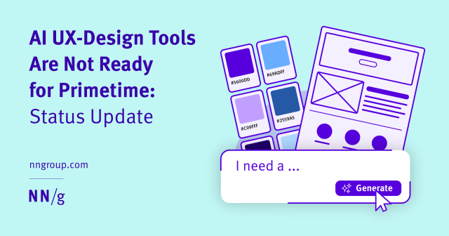
AI UX-Design Tools Are Not Ready for Primetime: Status Update
nngroup.com/articles/ai-design…
"Our research and evaluation shows that there are currently few design-specific AI tools that meaningfully enhance UX design workflows." -- #CalebSponheim #MeganBrown
YOWZA
Form Extractor Prototype
“This tool extracts the structure from an image of a form.”
github.com/timpaul/form-extrac…
#ai #LLM #UX #accessibility
GitHub - timpaul/form-extractor-prototype
Contribute to timpaul/form-extractor-prototype development by creating an account on GitHub.GitHub
Czech translation of LibreOffice Writer Guide 24.2 - The Document Foundation Blog
Zdeněk Crhonek (aka “raal”) from the Czech LibreOffice community writes: The Czech team has finished translating the LibrePffice Writer Guide 24.2. As usual it was a team effort, with translations by Petr Kuběj, Radomír Strnad and Zdeněk Crhonek.Mike Saunders (The Document Foundation)
Dark Patterns are now illegal in India - Bootcamp
The Indian government recently established guidelines to ban dark patterns in India. These guidelines are made to address underhand practices in digital design. These rules aim to protect consumers…Canvs Editorial (Bootcamp)
My FOSDEM talk about why visual change is good is finally up.
fosdem.org/2024/schedule/event…
#fosdem #thunderbird #ui #ux

Back to Basics: 5 HTML attributes for improved accessibility and user experience - HTMHell
A collection of bad practices in HTML, copied from real websites.Back to Basics: 5 HTML attributes for improved accessibility and user experience - HTMHell
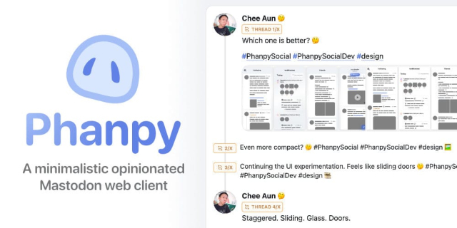
Uz nejakou dobu pouzivam na @wrksart klienta phanpy.social. Je hodne minimalisticky. Krade IP z pokemonu, mastodon pokemon, ha, genialni! Hodne veci mi vadi.
Ale jeho naprosta killer feature a duvod, proc si ho pro doom scrolling hudby a dalsiho umeni na WRKS necham, je vizualni oddeleni boostu od originalnich postu.
Vubec nechapu, proc to jeste nema kazdy klient. UX je uplny no-brainer. Obri timeline neskutecne zprehledni.
Please, don’t force me to log in
The current accelerating trend of requiring accounts and logins for everything has to stop.Juha-Matti Santala

Understand UX - UX Dictionary
Learning about UX? Or working with UX professionals? Find out what they're talking about in this community-built UX dictionary.UX dictionary
I needed to test support for dynamic accessible descriptions recently, so I made a blog post reference in case it's helpful for others.
darins.page/articles/dynamic-a…
#accessibility #a11y #html #webdev #ux #screenreader

Dynamic accessible descriptions reference - Darin Senneff
I recently needed to test the support of a dynamic accessible description – a element’s description that is initially one (or no) value, then changes to…Darin Senneff

Understand UX - UX Dictionary
Learning about UX? Or working with UX professionals? Find out what they're talking about in this community-built UX dictionary.UX dictionary
I can understand why it seems confusing. I guess someone would expect quote mark to quote comment text into reaction instead of sharing it.
Maybe someone here can find better icon for it for better #UX ?
Back to Basics: 5 HTML attributes for improved accessibility and user experience - HTMHell
A collection of bad practices in HTML, copied from real websites.Back to Basics: 5 HTML attributes for improved accessibility and user experience - HTMHell
The next Community Office Hours on Nov. 29 at 10 AM Pacific Standard Time is all about Cards View, and we're inviting @micah to tell all! If you have questions about Thunderbird visual design - and Thunderbird in general - please send them to officehours@thunderbird.net!
Office Hours are a fun and informal way to get to know the awesome people behind Thunderbird. We'll post soon how to join us live - or to catch the recording. And get those questions in early and often! #Thunderbird #UX
This:
“Scrollbars Are Becoming A Problem”, Artemis Everfree (artemis.sh/2023/10/12/scrollba…).
Via HN: news.ycombinator.com/item?id=3…
On Lobsters: lobste.rs/s/fhyvyr/scrollbars_…
#UX #Scrollbars #Scrolling #Design #Affordance #Accessibility #GUI
UX Principles that include Cognitive Accessibility
A Cognitive perspective on UX Design Principles including a neurodivergent perspective with links to relevant guidance and resources.www.ab11y.com
Modern Health, frameworks, performance, and harm
ericwbailey.website/published/…
"Performance, accessibility, and usability are more than inconvenient truths you can pretend don’t exist. They have a direct impact on the quality of someone’s life."
#webdev #webperf #ux #usability #a11y #uxd #webdesign

Modern Health, frameworks, performance, and harm
Performance, accessibility, and usability are more than just inconvenient truths you can pretend don’t exist. They have a direct impact on the quality of someone’s life…ericwbailey.website
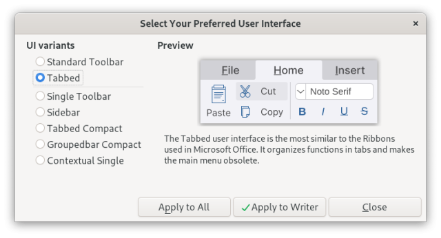
Some very vocal #LibreOffice devs consider that client-side window decorations (for example #GTK HeaderBar kind of things) are "NOT a #UX #design issue", and that it's all about the burden of maintaining that across different OSes/platforms.
Yeah… I might buy their argument if LibreOffice had the guts to actually commit to only one (or two) UI layouts and toolkits, instead of maintaining *seven* UI layout choices, to begin with 🙄️
bugs.documentfoundation.org/sh…
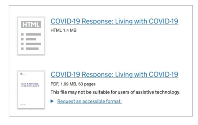
"Making a positive change: PDF to HTML
The Government Digital Service (GDS) states “Compared with HTML content, information published in a PDF is harder to find, use and maintain”."
Consider the needs of the people you are publishing the information for. Engage with them early to explore alternative options that may better meet their needs.
YES !
accessibility.blog.gov.uk/2023…
Making a positive change: PDF to HTML
This is for everyone: documenting how we rebuild inclusive digital services across governmentaccessibility.blog.gov.uk
Improving Drupal's Administration UX
For our first sponsored contribution time, we plan to help improve Drupal's admin UX. This details who we have coordinated with and what the next initiatives will be.Lullabot
Float labels may put you in the cool club, but they’re terrible UX.
It’s much better if your input’s label:
1) is legible
2) is above the input
3) doesn’t move about
4) is not mistaken for an answer
Simple > clever
-Adam Silver via Twitter
This is solely for UK audiences I'm afraid but if you have 20 minutes and would be up for a £15 e-gift voucher (highstreetvouchers.com), would love to get your feedback on some designs for a recurring donations user journey.
WARNING: This version is hosted on usabilityhub which isn't exactly the most accessible...
Here is the link - usabi.li/do/66f584ee610e/a030
Anyone otherwise interested in testing out coded prototypes etc., do get in touch!
#UX #UI #UserTesting

The F-Word
Frontend podcast by Bruce Lawson and Vadim Makeev.Frontend podcast by Bruce Lawson and Vadim Makeev.

Why do websites have so many pop-ups?
UI experts say pop-ups are a bad idea. So why is the “most hated” element of web design everywhere?s.e. smith (The Verge)
Alex Castellani (@alecaddd) is leading the charge on Thunderbird’s modern redesign, and we're thrilled to have him on the team!
But before he discovered the awesomeness of #OpenSource, he had to learn a hard life lesson about pricey, proprietary software...
Find out that story and much more in our "Meet The Team" series, a series of conversations with the people behind the software you use every day.
blog.thunderbird.net/2023/03/m…
#Thunderbird #Community #Linux #UX #Interview #Email

Meet The Team: Alex Castellani, Product Design Manager
Meet the humans behind the Thunderbird software you use and love. Let's kick it off with our Product Design manager, Alex Castellani!Jason Evangelho (The Thunderbird Blog)
@thunderbird, I'm enjoying the updated Thunderbird 112 Beta UI, but I was wondering if you could give us the option to disable the tab area and/or the new top menubar depending on how we configure our UI. If I choose to use the left-most vertical menubar, the other areas seem redundant and take up space. Otherwise, I like the new direction! 👍
#Email #Mail #Mozilla #Thunderbird #UI #UX #Outlook #Office #Office365 #Microsoft365 #OfficeSuite #Alternative #PIM #Tasks #Events #Calendar #Contacts
Alex Hollender's retrospective on a recent Wikipedia redesign
alexhollender.com/wikipedia-20…
reminded me of a post I wrote in 2019: Design, and Friction Preventing Design Improvement, in Open Tech
harihareswara.net/posts/2019/d…
On:
those exceptional #FLOSS projects that aren't developer tools, and are robust, & have high-quality user experience
problems & approaches in product management + #UX #design in #opensource, and people already working on it
Wikimedia & design pushback specifically
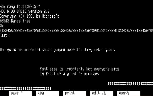
When designing #UI and #UX, consider the "Golden 8-bit Ratio".
Text was never hard to read on 8-bit systems. A single character, generally 8x8, was a large enough portion of the screen to remain legible at distance (ie TV).
The textmode ratio of 40 or 80 chars wide by 25 chars high is a standard on MANY microcomputers and terminals. On terminals, this ratio exists today.
Consider making your text at least this large. Tiny text is really, really shitty.
Update: moved this to my new writing site so there’s a new URL.
Every hashtag on every post on every platform should always be pascal case. I wrote this to illustrate how screenreaders read hashtags based on their case.
It’s a small thing that all of us can do to build a more inclusive, accessible internet for all. Please take the time to use pascal case.
markwrites.io/hashtag-accessib…
#Accessibility #WebAccessibility #Usability #Readability #Hashtags #SocialNetworking #Blogging #UX

Mark W.rites - Hashtag Accessibility, by Everyone for Everyone
My post about hashtag accessibility on Mastodon (and later LinkedIn) got a lot of attention. There were so many replies from people who didn’t know about the a…Mark W.rites
I'm in a hotel room with a visual-audible doorbell. Twice staff has come and knocked instead of used the doorbell. It's both good and bad. Here's why I'm grateful they're not using the doorbell.
Don't watch if flickering lights are a problem.
Can't upload captions. Here they are.
[Silence]
[Shrilling]
[Silence]#Accessibility #A11y #UX


