Search
Items tagged with: UX
This is an embeded video on a random page.
Yeah, I use #firefox containers, and everything google related is opening in one specific container to limit their spying on me. I opened the page in different container, thus I am not signed in.
Well ok, give me the link to the youtube video and I will watch it there? In the right container?
Youtube UX: no link to the video, but here you can watch some different stuff...
Just found this article stating that using the #language #attribute for individual words within a text is not a good idea when you want #ScreenReader users to have a good #UX. It's just overengineered #a11y.
I'm a bit surprised as you always read otherwise (as the article also mentions).
Are some screen reader users here that can share their experiences? I'm really curious now 🤔
netz-barrierefrei.de/en/lang-a…
How the Language Attribute is demaging Accessibility - Accessibility Consulting - Training & Support
The language attribute seems to make sense for accessibility, but only for sighted people.www.netz-barrierefrei.de
Reminder: new home for the Inclusive Design Principles
inclusivedesignprinciples.info… the old domain has lapsed and now advertises gambling 😑
Dear {everyone who writes software that has logins or full-name usernames}
Please hire some people with diverse names. Stupid name rules like no spaces, no special characters, no lower-case starts to words in a name – let alone presence of so-called "conventional" name elements (surname, forename, middle names, etc.) need to be dumped in a ditch forever. #UX
In just a few minutes, Inclusive Design 24 will be getting underway... 24 hours of #free talks about everything related to inclusive design:
inclusivedesign24.org/2024/
#accessibility #design #code #UX #XR #gaming #disability #a11y #id24
Authentication is almost always the most frustrating step of interacting with a service. Matrix is no different, but Quentin is about to dramatically improve the situation.
Get a glimpse of all the goodness awaiting to be unlocked once his project lands!
A $30 million lesson in what can happen if you don’t involve users in software updates, when you rush to market, and when the platform on which you rely doesn’t allow users to self-service by rolling back to a working version.
arstechnica.com/gadgets/2024/0…
Good job, Sonos! How much more will it cost to buy back trust?
#UX
Sonos’ $30M app fail is cautionary tale against rushing unnecessary updates
Sonos is delaying two hardware releases because of the app's problems.Ars Technica
LibreOffice design, UX and UI updates – TDF’s Annual Report 2023 - The Document Foundation Blog
Design has been one of the major focus points of LibreOffice in the last few years, and the Design community has produced new icon sets, new MIME type icons, a hugely improved dark mode, and improvements to the NotebookBar (This is part of The Docume…Mike Saunders (The Document Foundation)
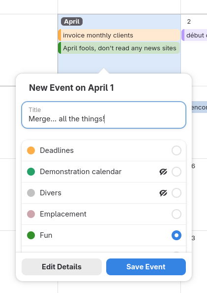
Part 1 of my #GNOMECalendar #webcal subscriptions #UX bugfixing trilogy has been merged today! No more duplicate calendars created by accident when adding a web calendar URL 🥳 gitlab.gnome.org/GNOME/gnome-c…
Avoid duplication when adding online calendars (!417) · Merge requests · GNOME / gnome-calendar · GitLab
To visually make sense from a UI standpoint, chronologically, this soft-depends on the cleanup changes provided inGitLab
Do you want to help make AntennaPod ready for the future? And do you have experience (or talent) in the domain of UX and/or UI design?
We're looking for folks to help us with embedding new innovative features on our player screen!
All details & contact options here👇
opensourcedesign.net/jobs/jobs…
#OpenSourceDesign #UX #UI #FOSS #OpenSourceContributions #Penpot #wireframes #volunteer #SummerProject #UXdesign #UIdesign
#Linux #UX bugs like this are frustrating: starting a drag action pops the window forward, obscuring the target window. I'm using latest #Fedora but apparently this happens on nearly all DEs.
The smaller your display is (and the more nontechnical you are) the more likely you'll hit this. Apparently this has been known for a long time and no one cares to fix it? I'm just curious why.
"Not enough programmers" isn't a good excuse, this is a fairly easy fix. @cassidy Devs only use Terminal?
https://whatcanidoforlibreoffice.org
Explore how you can contribute to LibreOffice, the leading open-source office suite. Whether you're a developer, designer, tester, or advocate, find out how your skills can help improve and promote LibreOffice.whatcanidoforlibreoffice.org
I remember longing for proper skipping of descenders in #CSS. Now that skipping is default in most browser I’m often struck by how *terrible* it is for hyperlink legibility.
The first line in the image shows a linked line with text-decoration-skip-ink set to "auto".
The second line shows the same linked line with text-decoration-skip-ink set to "none".
Just by looking at the first line, you can’t say if it is multiple links or or not.
Perhaps something for @Seirdy.
I believe this is the first of its kind implementation on the web, i.e. first-letter navigation, so kudos to the Drive team! :) #accessibility #ux unmute.community/@payown/11236…
AI UX-Design Tools Are Not Ready for Primetime: Status Update
nngroup.com/articles/ai-design…
"Our research and evaluation shows that there are currently few design-specific AI tools that meaningfully enhance UX design workflows." -- #CalebSponheim #MeganBrown
YOWZA
Form Extractor Prototype
“This tool extracts the structure from an image of a form.”
github.com/timpaul/form-extrac…
#ai #LLM #UX #accessibility
GitHub - timpaul/form-extractor-prototype
Contribute to timpaul/form-extractor-prototype development by creating an account on GitHub.GitHub
Czech translation of LibreOffice Writer Guide 24.2 - The Document Foundation Blog
Zdeněk Crhonek (aka “raal”) from the Czech LibreOffice community writes: The Czech team has finished translating the LibrePffice Writer Guide 24.2. As usual it was a team effort, with translations by Petr Kuběj, Radomír Strnad and Zdeněk Crhonek.Mike Saunders (The Document Foundation)
Dark Patterns are now illegal in India - Bootcamp
The Indian government recently established guidelines to ban dark patterns in India. These guidelines are made to address underhand practices in digital design. These rules aim to protect consumers…Canvs Editorial (Bootcamp)
My FOSDEM talk about why visual change is good is finally up.
fosdem.org/2024/schedule/event…
#fosdem #thunderbird #ui #ux
Back to Basics: 5 HTML attributes for improved accessibility and user experience - HTMHell
A collection of bad practices in HTML, copied from real websites.Back to Basics: 5 HTML attributes for improved accessibility and user experience - HTMHell
Uz nejakou dobu pouzivam na @wrksart klienta phanpy.social. Je hodne minimalisticky. Krade IP z pokemonu, mastodon pokemon, ha, genialni! Hodne veci mi vadi.
Ale jeho naprosta killer feature a duvod, proc si ho pro doom scrolling hudby a dalsiho umeni na WRKS necham, je vizualni oddeleni boostu od originalnich postu.
Vubec nechapu, proc to jeste nema kazdy klient. UX je uplny no-brainer. Obri timeline neskutecne zprehledni.
Please, don’t force me to log in
The current accelerating trend of requiring accounts and logins for everything has to stop.Juha-Matti Santala
Understand UX - UX Dictionary
Learning about UX? Or working with UX professionals? Find out what they're talking about in this community-built UX dictionary.UX dictionary
I needed to test support for dynamic accessible descriptions recently, so I made a blog post reference in case it's helpful for others.
darins.page/articles/dynamic-a…
#accessibility #a11y #html #webdev #ux #screenreader
Dynamic accessible descriptions reference - Darin Senneff
I recently needed to test the support of a dynamic accessible description – a element’s description that is initially one (or no) value, then changes to…Darin Senneff
Understand UX - UX Dictionary
Learning about UX? Or working with UX professionals? Find out what they're talking about in this community-built UX dictionary.UX dictionary
I can understand why it seems confusing. I guess someone would expect quote mark to quote comment text into reaction instead of sharing it.
Maybe someone here can find better icon for it for better #UX ?
Back to Basics: 5 HTML attributes for improved accessibility and user experience - HTMHell
A collection of bad practices in HTML, copied from real websites.Back to Basics: 5 HTML attributes for improved accessibility and user experience - HTMHell
The next Community Office Hours on Nov. 29 at 10 AM Pacific Standard Time is all about Cards View, and we're inviting @micah to tell all! If you have questions about Thunderbird visual design - and Thunderbird in general - please send them to officehours@thunderbird.net!
Office Hours are a fun and informal way to get to know the awesome people behind Thunderbird. We'll post soon how to join us live - or to catch the recording. And get those questions in early and often! #Thunderbird #UX
This:
“Scrollbars Are Becoming A Problem”, Artemis Everfree (artemis.sh/2023/10/12/scrollba…).
Via HN: news.ycombinator.com/item?id=3…
On Lobsters: lobste.rs/s/fhyvyr/scrollbars_…
#UX #Scrollbars #Scrolling #Design #Affordance #Accessibility #GUI
UX Principles that include Cognitive Accessibility
A Cognitive perspective on UX Design Principles including a neurodivergent perspective with links to relevant guidance and resources.www.ab11y.com
Modern Health, frameworks, performance, and harm
ericwbailey.website/published/…
"Performance, accessibility, and usability are more than inconvenient truths you can pretend don’t exist. They have a direct impact on the quality of someone’s life."
#webdev #webperf #ux #usability #a11y #uxd #webdesign
Modern Health, frameworks, performance, and harm
Performance, accessibility, and usability are more than just inconvenient truths you can pretend don’t exist. They have a direct impact on the quality of someone’s life…ericwbailey.website
Some very vocal #LibreOffice devs consider that client-side window decorations (for example #GTK HeaderBar kind of things) are "NOT a #UX #design issue", and that it's all about the burden of maintaining that across different OSes/platforms.
Yeah… I might buy their argument if LibreOffice had the guts to actually commit to only one (or two) UI layouts and toolkits, instead of maintaining *seven* UI layout choices, to begin with 🙄️
bugs.documentfoundation.org/sh…
"Making a positive change: PDF to HTML
The Government Digital Service (GDS) states “Compared with HTML content, information published in a PDF is harder to find, use and maintain”."
Consider the needs of the people you are publishing the information for. Engage with them early to explore alternative options that may better meet their needs.
YES !
accessibility.blog.gov.uk/2023…
Making a positive change: PDF to HTML
This is for everyone: documenting how we rebuild inclusive digital services across governmentaccessibility.blog.gov.uk