Solution: just use a regular single input field, folks!
#accessibility #a11y #openweb #webdev #javascript #2fa #login #web #ux #usability #ui
Question for the Mastodon hive mind:
Primer:
I have a need to convert, resize, reorient, and transcode video for various stages of our video edit and distribution pipeline. I've been doing all of this in ffMpeg, via command line arguments and custom-coded scripts. However, the needs of this thing just simply don't scale that way. And no one but me gets access to the CLI on these systems. So that's just not feseable.
Now finally, to the question.
I am looking for an open-source web frontend to ffMpeg that is, if not fully accessible, as that is a very tall order, but at least usable by an experienced screen reader user with the typical tools and hacks learned over twenty years of experience. Just something that doesn't make accessibility a barrier and most importantly, a time waster.
Please boost far and wide for reach, with thanks.
Ready! Set! Fire!
#A11Y #Accessibility #ffmpeg #web #Interface #WebUI #UI #UX
Accessibility poll for people who use screen readers for daily use. I’m writing a guide about alt text.
🧵 Poll 2 of 2:
I’d like your opinion about long description methods for complex images. What is your preferred approach? (Feel free to comment if you want to elaborate.)
Please boost for reach. 🙌🏻
#Accessibility #A11y #ScreenReaders #AltText #WCAG #UI #FrontEnd
Accessibility poll for people who use screen readers for daily use. I’m writing a guide about alt text.
🧵 Poll 1 of 2:
I’d like your opinion about alt-text length for simple images. How long should it be? (Feel free to comment if you want to elaborate.)
Please boost for reach. 🙌🏻
#Accessibility #A11y #ScreenReaders #AltText #WCAG #UI #FrontEnd
I really like the idea of #deltachat but I never tried it until now.
It just seemed sooo uninteresting. Why? Because of the graphical and #UI branding.
I'm not even a huge UI fan, I use CLI apps 90% of the time. But the mundane and gray logo, the gray UI, every graphical element of it seems so uninteresting.
The screenshots look like they are from 2010s.
I think upping their design game will really boost users.
Delta is a unique idea on the backend, give users a unique experience in the frontend too.
In the Starfleet Technical Manual, there is a throwaway detail of the LCARS user interface that when it is upgraded, users can still utilize the previous several versions. This is because their work is mission-critical and it is unacceptable to compromise the mission by forcing unfamiliar changes; eventual retraining is part of their job, but the flexibility allows them to take the retraining at their own pace.
I think about this from time-to-time and how this is still a sci-fi idea that is seen all too rarely in how we do actual computer UIs.
Love LibreOffice development? Want to turn your passion into a paid job? We are The Document Foundation (TDF), the non-profit entity behind LibreOffice.Open Source JobHub
If you've been hoping for a release that offers more UI customizations, you're in for a treat.Linux Magazine
I recently drove a car whose whole control and entertainment system was a gigantic iPad-like thing mounted to the dash. It caused me to have a realisation about the #Ui and #UX of touch screens.
There is no way to touch a touchscreen without it treating that touch as intentional. What I mean is: without taking my eyes off the road, I can grope across the dashboard, find a knob or button—by touching it—without activating any function. Touching the volume button or temperature knob doesn’t DO anything until I do it with more force and intentionality. Not so for a #touchscreen.
My mobile #phone (an #iPhone 13) has no dead space in its face. There’s no part of the phone face I can touch without it assuming I meant to do that and I wanted to activate whatever was under my finger. Old iPhones that had physical home buttons also had dead space to either side: a safe space to hold the phone without DOING anything.
Computer keyboard have little raised pips on the F and J keys so you can find them by touch without looking. I do this all the time. But I don’t type the letters F or J. Touch screens have no such affordances.
I look at the #blackberry keyboard in this photo and I see a raised space bar. It’s an #affordance that lets you orient your fingers, and orient how you hold the phone, without looking.
I miss buttons.
mobilesyrup.com/2025/02/15/bla…

Let's all close our eyes and go back to 2009 so we can feel the thrill of typing our first email on the go.Brad Bennett (MobileSyrup)
This is what I think about whenever infosec wonks on here start telling people they should use matrix or xmpp+omemo or whatnot instead of signal
To be fair, I understand the arguments and to a large extent I agree with the critiques. However, I think anyone making these recommendations is vastly underestimating the capacity or appetite for most people to deal with the user experiences presented by these alternatives.
User experience is the ultimate force multiplier. For anything that requires network effects to function (ie most anything involving communication), if it doesn't *just work* then you've lost 90% of your audience.
#matrix #xmpp #infosec #cybersecurity #signal #ux #design #ui #encryption #privacy #crypto
Learning question and a call for action:
Why do people say that the #friendica user interface #UI as seen from a standard laptop desktop, in other words a working station screen, isn't a pleasant experience?
This looks like serious stuff to me, like a #newsPaper outlet similiar to #NYtimes or #ZEIT.
Can somebody please #enshittify this #KISS a littel bit, wasting time, attention and selfconfidence of the coder community!
@Jeff Jarvis @Eva Wolfangel @Christian Stöcker @taz @taz @Digitalcourage @Cory Doctorow
Dear @libreoffice ,
I believe it is time to change the default interface layout to a design that is much more intuitive, accessible, and easy to understand for those unfamiliar with LibreOffice.
I would like to suggest making the default interface layout “Contextual Single” when it is ready, if only for the sake of those using LibreOffice for the first time.
Thank you! 
I am pleased to announce a new Cambalache stable release, version 0.92.0!
What's new:
- Basic port to Adwaita
- Use Casilda compositor for workspace
- Update widget catalogs to SDK 47
- Improved Drag&Drop support
- Improve workspace performance
- Enable workspace animations
- Support new desktop dark style
- Support 3rd party libraries
- Streamline headerbar
- Lots of bug fixes and minor improvements
Read more about it at blogs.gnome.org/xjuan/2024/09/…
Do you want to help make AntennaPod ready for the future? And do you have experience (or talent) in the domain of UX and/or UI design?
We're looking for folks to help us with embedding new innovative features on our player screen!
All details & contact options here👇
opensourcedesign.net/jobs/jobs…
#OpenSourceDesign #UX #UI #FOSS #OpenSourceContributions #Penpot #wireframes #volunteer #SummerProject #UXdesign #UIdesign
Moxxy UI: May 2024 progress report
This month I worked on the Chat screen. Feel free to send me some feedback, especially about the blur filter because I feel like I need an outside perspective on the subject!
ailyaut.robotfumeur.fr/blog/20…

Let's start with a little announcement: from now on, I'll be publishing my .penpot file in the moxxy/design repository on Codeberg on a monthly basis, so that everyone can tinker with the interface to their heart's content! I should have done it from…ailyaut.robotfumeur.fr
Second blog post on the #moxxy UI! Unfortunately I've had a very busy month and don't have much new to report. Hopefully I'll have more time in May to work on new screens. #xmpp #penpot #ui
ailyaut.robotfumeur.fr/blog/20…

April has been a busy month, partly due to a Windows Defender Trojan alert that gave me a good excuse to wipe my entire disk and switch to Linux. So this post will be short and without any major news.ailyaut.robotfumeur.fr
My FOSDEM talk about why visual change is good is finally up.
fosdem.org/2024/schedule/event…
#fosdem #thunderbird #ui #ux
Put your kettles on and come learn about Cards View and how we tackle visual design! Community Office Hours start in half an hour - get the Zoom link and password in the blog post:
blog.thunderbird.net/2023/11/u…

New format, special guest! Join us for Thunderbird Community Office Hours on November 29, 2023 to discuss Cards View and more.Heather Ellsworth (The Thunderbird Blog)
Just a friendly reminder to join us tomorrow at 18:00 UTC for our Community Office Hours all about visual design and Cards View with @micah! Find out how to join the call, hang out with the team, and learn how UI changes happen and how to get involved below!
blog.thunderbird.net/2023/11/u…

New format, special guest! Join us for Thunderbird Community Office Hours on November 29, 2023 to discuss Cards View and more.Heather Ellsworth (The Thunderbird Blog)
Has been released Lapce v0.3.0 🎉
Lapce (IPA: /læps/) is a modern Open Source, Lightning-fast, and Powerful code editor, written in pure Rust with a UI in Floem. 🦀
#OpenSource #CodeEditor #Rust #Lapce #Floem #UI #Editor #FOSS #Developer #Experience #DX
github.com/lapce/lapce/release…

Features/Changes #2190: Rewrite with Floem UI #2425: Reimplement completion lens #2498: Show Lapce as an option when doing "Open With..." on Linux #2549: Implement multi-line vim-motion yank and d...GitHub
Quick FYI 🏁 🏎️
Prior to #GoDaddy killing my #POP #Email client access on June 2 as part of #Microsoft's mandate to force users onto its #Exchange protocol, I switched from #Outlook 2016 to #Thunderbird 114 Beta (which still connects w/ #POP3 + #OAuth2 - unsure if it's a glitch, but it works)
Thunderbird 114 Beta Portable (it's the version I'm using)
portableapps.com/apps/internet…
Since Thunderbird team is moving towards its new #Supernova #UI for Thunderbird 115, there's a mixture of old & new menus
Thunderbird, Portable Edition Test is a test version of the popular Thunderbird email client bundled with a PortableApps.PortableApps.com
This is solely for UK audiences I'm afraid but if you have 20 minutes and would be up for a £15 e-gift voucher (highstreetvouchers.com), would love to get your feedback on some designs for a recurring donations user journey.
WARNING: This version is hosted on usabilityhub which isn't exactly the most accessible...
Here is the link - usabi.li/do/66f584ee610e/a030
Anyone otherwise interested in testing out coded prototypes etc., do get in touch!
#UX #UI #UserTesting
@thunderbird, I'm enjoying the updated Thunderbird 112 Beta UI, but I was wondering if you could give us the option to disable the tab area and/or the new top menubar depending on how we configure our UI. If I choose to use the left-most vertical menubar, the other areas seem redundant and take up space. Otherwise, I like the new direction! 👍
#Email #Mail #Mozilla #Thunderbird #UI #UX #Outlook #Office #Office365 #Microsoft365 #OfficeSuite #Alternative #PIM #Tasks #Events #Calendar #Contacts
When designing #UI and #UX, consider the "Golden 8-bit Ratio".
Text was never hard to read on 8-bit systems. A single character, generally 8x8, was a large enough portion of the screen to remain legible at distance (ie TV).
The textmode ratio of 40 or 80 chars wide by 25 chars high is a standard on MANY microcomputers and terminals. On terminals, this ratio exists today.
Consider making your text at least this large. Tiny text is really, really shitty.
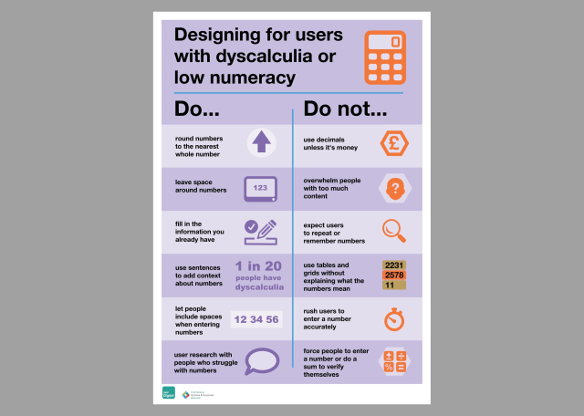
Designing for People with Dyscalculia and Low Numeracy
designnotes.blog.gov.uk/2022/1…
#UX #UI #Dyscalculia #articles #BestPractices #design

We believe in working in the open. This blog is for designers across government to share their projects, ideas and concepts, or just to think out loud.designnotes.blog.gov.uk
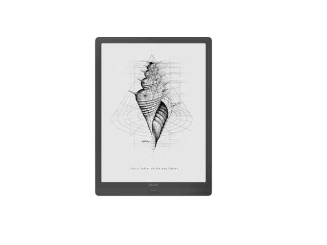
E-Ink Design Principles for Web and Applications
... I’ve looked for existing sets of guidelines without luck, so apparently I get to draw my own line in the sand. An earlier version of this post proved popular on Mastodon, I’m expanding it here. This is a first effort and some of my suggestions may not hold up, though I hope most will. Further discussion on that point at the end of this post....
(more at link)
diaspora.glasswings.com/posts/…
This is based off an earlier toot as part of a longer thread, here:
toot.cat/@dredmorbius/10859547…
I felt this needed and deserved a post-length treatment and so it has one.
I'd very much like to hear criticisms / improvements.
#eink #ui #ux #interfaces #UIUX #design #WebDesign #AppDesign

E-Ink Design Principles for Web and Applications If you're engaged in application or Web UI/UX design for E-Ink devices or displays (https://en.wikipedia.org/wiki/Electronic_paper), it helps to keep in mind what these displays' capabilities are.Glass Wings diaspora* social network
Reasonable Colors is an open-source colour system for making accessible colour palettes.
It uses an intuitive system of shades to help you select colours which meet the appropriate WCAG contrast rating, even if you're mixing and matching base colours:
#opensource #design #ui #uidesign #color #colour #accessibility
Reasonable Colors is an open-source color system that makes it easy to build accessible, nice-looking color palettes.Reasonable Colors