Search
Items tagged with: ui
Für @nextcloud@mastodon.xyz habe ich große Sympatie.
Sie wird allerdings mehr und mehr auf die Probe gestellt.
* Die Desktop- und Android-Clients, die nach dem Update wieder mal alles neu synchronisieren möchten
* Das Deck welches dringend #UI und Funktionalitätsverbesserungen verträgt
* Die Nautilus-Desktop-Erweiterung, die für Blinde und Sehgeschädigte nahezu unbenutzbar ist und für Sehende nicht viel besser
... um nur ein paar Beispiele zu nennen.
Wären Arbeiten an den Basisfunktionalitäten nicht wichtiger als immer neue Hubs mit irgendwelchem AI-Zeugs?
Are you overwhelmed with background windows demanding attention, or just the amount of color on your computer screen? Do you wish it was a bit easier to tell which window has (keyboard) focus?
Oh, and are you using GNOME?
Because I released my first extension for GNOME Shell, and it desaturates background windows. Get it on extensions.gnome.org. If you want.
Hope you enjoy!
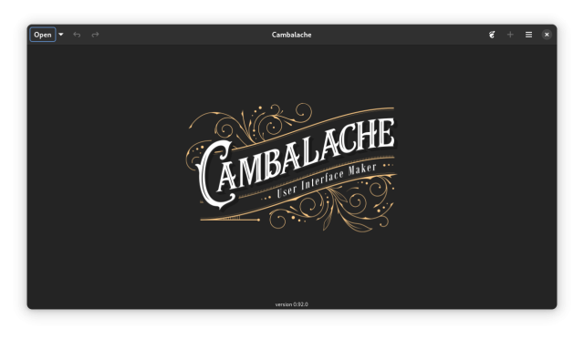
I am pleased to announce a new Cambalache stable release, version 0.92.0!
What's new:
- Basic port to Adwaita
- Use Casilda compositor for workspace
- Update widget catalogs to SDK 47
- Improved Drag&Drop support
- Improve workspace performance
- Enable workspace animations
- Support new desktop dark style
- Support 3rd party libraries
- Streamline headerbar
- Lots of bug fixes and minor improvements
Read more about it at blogs.gnome.org/xjuan/2024/09/…
Do you want to help make AntennaPod ready for the future? And do you have experience (or talent) in the domain of UX and/or UI design?
We're looking for folks to help us with embedding new innovative features on our player screen!
All details & contact options here👇
opensourcedesign.net/jobs/jobs…
#OpenSourceDesign #UX #UI #FOSS #OpenSourceContributions #Penpot #wireframes #volunteer #SummerProject #UXdesign #UIdesign
Moxxy UI: May 2024 progress report
This month I worked on the Chat screen. Feel free to send me some feedback, especially about the blur filter because I feel like I need an outside perspective on the subject!
ailyaut.robotfumeur.fr/blog/20…
Moxxy UI: May 2024 progress report – Ailyaut's blog
Let's start with a little announcement: from now on, I'll be publishing my .penpot file in the moxxy/design repository on Codeberg on a monthly basis, so that everyone can tinker with the interface to their heart's content! I should have done it from…ailyaut.robotfumeur.fr
Second blog post on the #moxxy UI! Unfortunately I've had a very busy month and don't have much new to report. Hopefully I'll have more time in May to work on new screens. #xmpp #penpot #ui
ailyaut.robotfumeur.fr/blog/20…
Moxxy UI: April 2024 progress report – Ailyaut's blog
April has been a busy month, partly due to a Windows Defender Trojan alert that gave me a good excuse to wipe my entire disk and switch to Linux. So this post will be short and without any major news.ailyaut.robotfumeur.fr
My FOSDEM talk about why visual change is good is finally up.
fosdem.org/2024/schedule/event…
#fosdem #thunderbird #ui #ux
Put your kettles on and come learn about Cards View and how we tackle visual design! Community Office Hours start in half an hour - get the Zoom link and password in the blog post:
blog.thunderbird.net/2023/11/u…
Join Us For November 2023 Thunderbird Community Office Hours
New format, special guest! Join us for Thunderbird Community Office Hours on November 29, 2023 to discuss Cards View and more.Heather Ellsworth (The Thunderbird Blog)
Just a friendly reminder to join us tomorrow at 18:00 UTC for our Community Office Hours all about visual design and Cards View with @micah! Find out how to join the call, hang out with the team, and learn how UI changes happen and how to get involved below!
blog.thunderbird.net/2023/11/u…
Join Us For November 2023 Thunderbird Community Office Hours
New format, special guest! Join us for Thunderbird Community Office Hours on November 29, 2023 to discuss Cards View and more.Heather Ellsworth (The Thunderbird Blog)
Has been released Lapce v0.3.0 🎉
Lapce (IPA: /læps/) is a modern Open Source, Lightning-fast, and Powerful code editor, written in pure Rust with a UI in Floem. 🦀
#OpenSource #CodeEditor #Rust #Lapce #Floem #UI #Editor #FOSS #Developer #Experience #DX
github.com/lapce/lapce/release…
Release v0.3.0 · lapce/lapce
Features/Changes #2190: Rewrite with Floem UI #2425: Reimplement completion lens #2498: Show Lapce as an option when doing "Open With..." on Linux #2549: Implement multi-line vim-motion yank and d...GitHub
Quick FYI 🏁 🏎️
Prior to #GoDaddy killing my #POP #Email client access on June 2 as part of #Microsoft's mandate to force users onto its #Exchange protocol, I switched from #Outlook 2016 to #Thunderbird 114 Beta (which still connects w/ #POP3 + #OAuth2 - unsure if it's a glitch, but it works)
Thunderbird 114 Beta Portable (it's the version I'm using)
portableapps.com/apps/internet…
Since Thunderbird team is moving towards its new #Supernova #UI for Thunderbird 115, there's a mixture of old & new menus
Thunderbird, Portable Edition Test (email client) | PortableApps.com
Thunderbird, Portable Edition Test is a test version of the popular Thunderbird email client bundled with a PortableApps.PortableApps.com
This is solely for UK audiences I'm afraid but if you have 20 minutes and would be up for a £15 e-gift voucher (highstreetvouchers.com), would love to get your feedback on some designs for a recurring donations user journey.
WARNING: This version is hosted on usabilityhub which isn't exactly the most accessible...
Here is the link - usabi.li/do/66f584ee610e/a030
Anyone otherwise interested in testing out coded prototypes etc., do get in touch!
#UX #UI #UserTesting
@thunderbird, I'm enjoying the updated Thunderbird 112 Beta UI, but I was wondering if you could give us the option to disable the tab area and/or the new top menubar depending on how we configure our UI. If I choose to use the left-most vertical menubar, the other areas seem redundant and take up space. Otherwise, I like the new direction! 👍
#Email #Mail #Mozilla #Thunderbird #UI #UX #Outlook #Office #Office365 #Microsoft365 #OfficeSuite #Alternative #PIM #Tasks #Events #Calendar #Contacts
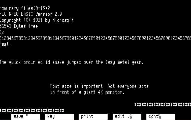
When designing #UI and #UX, consider the "Golden 8-bit Ratio".
Text was never hard to read on 8-bit systems. A single character, generally 8x8, was a large enough portion of the screen to remain legible at distance (ie TV).
The textmode ratio of 40 or 80 chars wide by 25 chars high is a standard on MANY microcomputers and terminals. On terminals, this ratio exists today.
Consider making your text at least this large. Tiny text is really, really shitty.
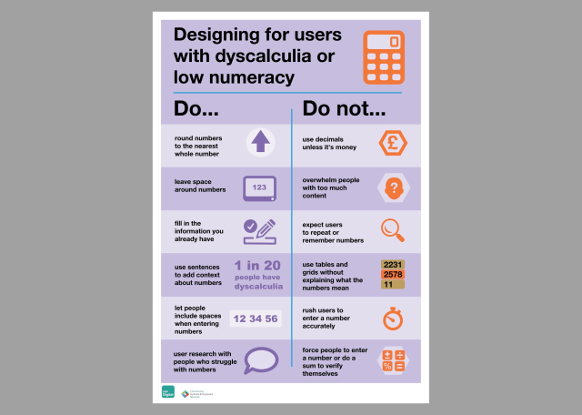
Designing for People with Dyscalculia and Low Numeracy
designnotes.blog.gov.uk/2022/1…
#UX #UI #Dyscalculia #articles #BestPractices #design
Designing for people with dyscalculia and low numeracy
We believe in working in the open. This blog is for designers across government to share their projects, ideas and concepts, or just to think out loud.designnotes.blog.gov.uk
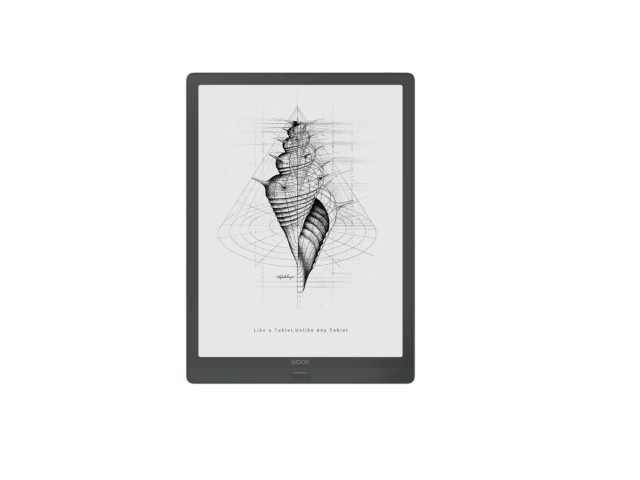
E-Ink Design Principles for Web and Applications
... I’ve looked for existing sets of guidelines without luck, so apparently I get to draw my own line in the sand. An earlier version of this post proved popular on Mastodon, I’m expanding it here. This is a first effort and some of my suggestions may not hold up, though I hope most will. Further discussion on that point at the end of this post....
- Persistence is free
- Pixels are cheap
- Paints are expensive ...
(more at link)
diaspora.glasswings.com/posts/…
This is based off an earlier toot as part of a longer thread, here:
toot.cat/@dredmorbius/10859547…
I felt this needed and deserved a post-length treatment and so it has one.
I'd very much like to hear criticisms / improvements.
#eink #ui #ux #interfaces #UIUX #design #WebDesign #AppDesign
E-Ink Design Principles for Web and Applications
E-Ink Design Principles for Web and Applications If you're engaged in application or Web UI/UX design for E-Ink devices or displays (https://en.wikipedia.org/wiki/Electronic_paper), it helps to keep in mind what these displays' capabilities are.Glass Wings diaspora* social network
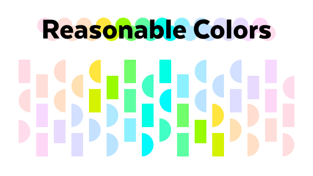
Reasonable Colors is an open-source colour system for making accessible colour palettes.
It uses an intuitive system of shades to help you select colours which meet the appropriate WCAG contrast rating, even if you're mixing and matching base colours:
#opensource #design #ui #uidesign #color #colour #accessibility
Reasonable Colors
Reasonable Colors is an open-source color system that makes it easy to build accessible, nice-looking color palettes.Reasonable Colors